Carol Stamps
  • Carol Stamps
  • Compendium of Curiosisties 3 Challenge - Gallery
  • Tim Holtz
    • 12 Tags of ...
    • Creative Chemistry 101
    • Creative Chemistry 102
    • Creative Chemistry 103
    • Summer of Creative Chemistry 2016
    • #hipforsummer 2017
    • #sharewithsizzix
    • #holtzforhalloween
    • #holtzfortheholidays
    • Share-a-Scare
    • Tim Holtz Christmas photo holder
  • Simon Says Stamp Challenges
    • Simon Says Create
  • Frilly and Funkie Challenges
  • Sunday Stamper
  • More Than Words
  • Creative Carte Blanche
  • Altenew
  • Seven Hills
  • Hero Arts
  • WOW! Embossing Powder
  • Graphic 45
  • Virginia's View Challenge
  • Dyan Reaveley classes, 2015
  • Just playing around
    • Art Swaps
    • Club Posh
    • Stencil Girl
    • Ranger Kits
    • Stamptember
  • Lindy's Stamp Gang
  • WOW! Challenges
  • Ellen Huston
  • OnLine Card Class
  • All About ATCs

Compendium of Curiosities Vol3, Revisiting Challenge #34

8/3/2015

5 Comments

 
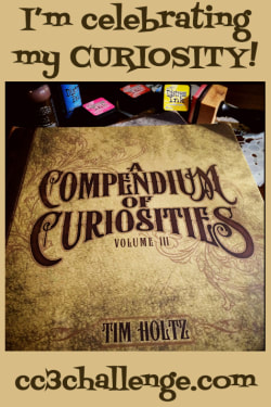
Since I failed to follow instructions completely on the layering stencil paint monoprint that was the 34th (and last) challenge based on Tim Holtz'  Compendium of Curiosities, Volume 3, and since that very same challenge including instructions for creating a distress ink monoprint (Part 48 of The Compendium), I thought I'd take another crack at layering stencil monoprinting. I'm having trouble giving up on the challenges (I will surely miss them!)! And THIS time, I did read the instructions!

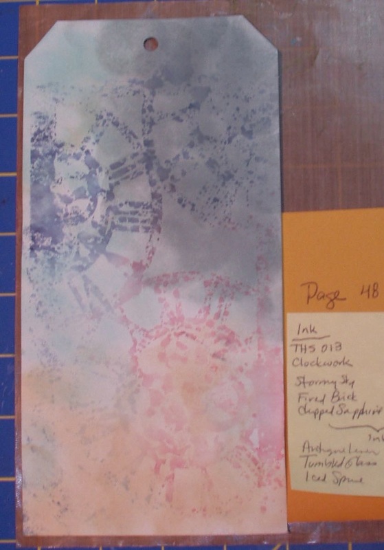
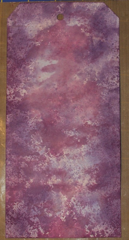
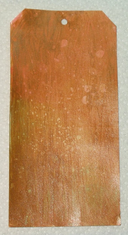
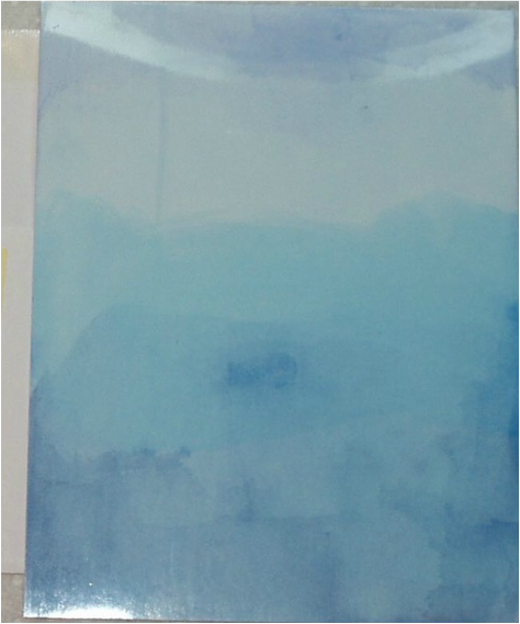
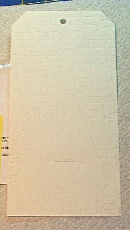
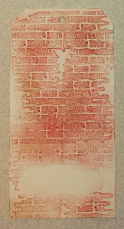
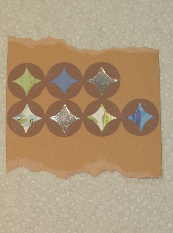
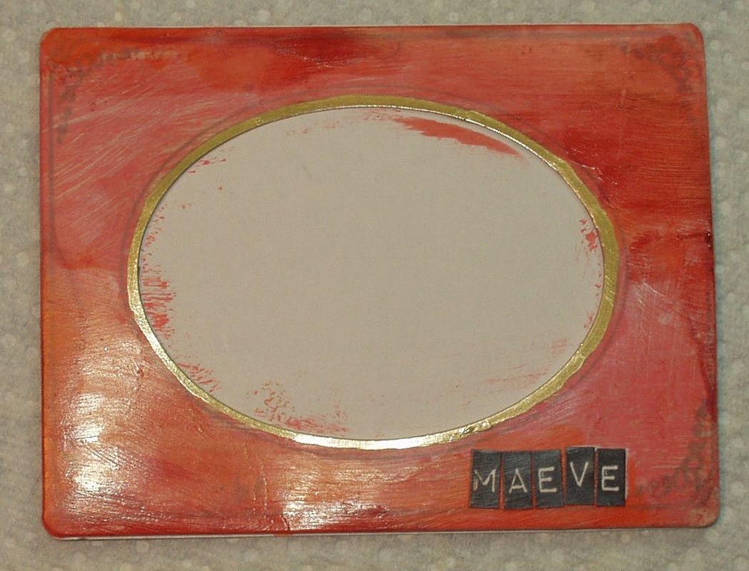
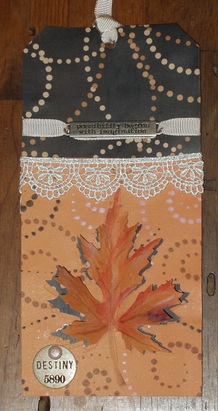
I used Tim’s technique to create a mono-printed background in ink on a large tag. I used the “Clockwork” Stencil and Distress Inks (“Stormy Sky”, “Fired Brick” and “Chipped Sapphire”) to create the monoprint as per the instructions in the book. I then “distressed” the tag by blending in the background with “Antique Linen”, “Tumbled Glass” and “Iced Spruce” Distress Inks:
Picture
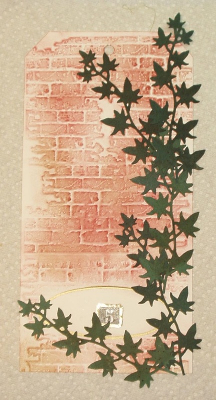
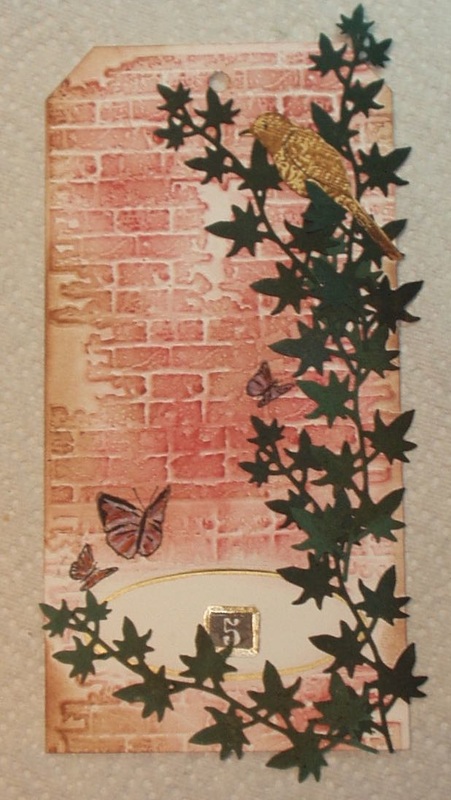
Even though I did it "right" this time, I'm not totally happy with the end result --- my color choices were a little off (should have gone with something other than "Iced Spruce", I think) so the tag came out a little too dark, especially in the upper right corner. Oh well, live and learn. And, as a background, it could work. It certainly pushes me in the darker, "noir" direction, not usually my comfort zone...

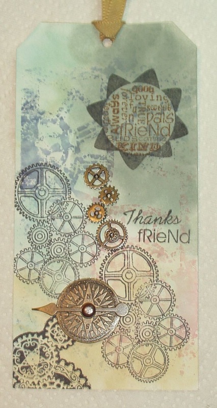
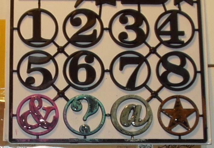
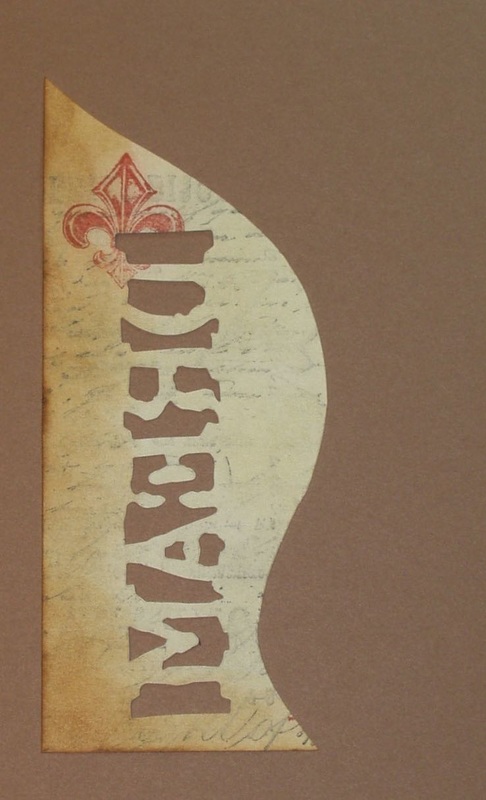
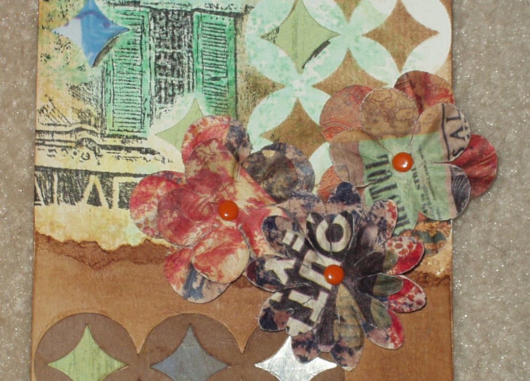
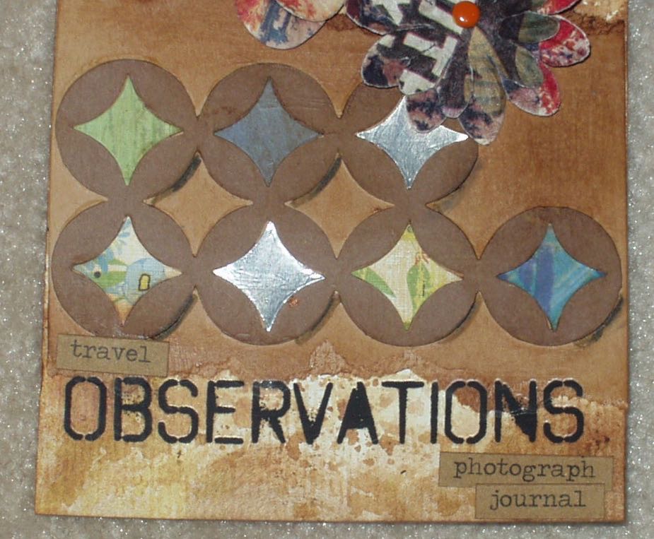
Since the clockwork stencil consisted of “circles”, I decided to go with interlocking “circles” in Archival “Jet Black” Ink and “Vintage Photo” Distress Ink. The stamps I used were “Steampunk Gears” and “Gears Background” by Deep Red (3x504244 and 3x504230, respectively), and “Word Flower Power” by My Sentiments Exactly (TT247). I then added a compass face and indicator arrow and four “mini-Gears” ( the latter being from the TH93012 Idea-ology collection; not sure about the source of the compass and arrow — they were part of a kit with the label long since lost). A brass-colored grosgrain ribbon and the tag is complete:
Picture
Thanks, Friend!
This was the last in a series of challenges, based on the contents of Tim Holtz's book, Compendium of Curiosities, Vol. 3, is hosted by Linda Ledbetter from her blog Studio L3, Linda and her talented design team put together their interpretations of the bi-weekly challenges, two fantabulous stores offer gift certificates for winners in alternating weeks (challenge #34 challenge iss sponsored by the Funkie Junkie Boutique) and Tim Holtz and his friend and factotum Mario Rossi II have donated a cache of goodies form which another prize is assembled.

The rules are simple:
    •    One must work from the book and not reveal Tim's techniques
    •    You need to link your creation to Linda's blog
    •    You need to visit the design team's blogs and leave comments on their interpretations.

Product used in this tag's creation were:
  • Stencil: "Clockwork" (THS013)
  • Stamps: Deep Red "Steampunk Gears" (3x504244) and "Gears Background" (3x504230); My Sentiments Exactly "Word Flower Power" (TT247))
  • Distress Inks: "Stormy Sky", "Fired Brick", "Chipped Sapphire", "Antique Linen", "Tumbled Glass",  "Iced Spruce", "Vintage Photo"
  • Archival Ink "Jet Black"
  • Embellishments: Idea-ology "Mini Gears" (TH93012), compass face and spinner

5 Comments

Compendium of Curiosities Vol3, Challenge #33

7/21/2015

8 Comments

 
This series of challenges, based on the contents of Tim Holtz's book, Compendium of Curiosities, Vol. 3, is hosted by Linda Ledbetter from her blog Studio L3 and she is assisted in this challenge by a design team of eight talented artists, two stores and the team of Tim Holtz and Mario Rossi II. Linda and the design team put together their interpretations of the bi-weekly challenges, the stores offer gift certificates for winners in alternating weeks (challenge # challenge is sponsored by The Inspiration Emporium and Tim and Mario have donated a cache of goodies form which another prize is assembled.

The rules are simple:
    •    One must work from the book and not reveal Tim's techniques (If you don't have the book, you can get one from Tim.)
    •    You need to link your creation to Linda's blog
    •    You need to visit the design team's blogs and leave comments on their interpretations.

This week’s challenge is to implement the technique described on Page 45 “Altered Surfaces.” I chose four of the “Alpha Parts - Framed” to experiment with and, following Tim’s instructions, altered their surfaces with “Abandoned Coral” and “Picked Raspberry” (the ampersand), “Cracked Pistachio” and “Broken China” (the question mark), “Old Paper” and “Iced Spruce” (the @ - I have no clue what this is called!), and “Antique Bronze” (the star):
Picture
I also played with backgrounds using Yvonne Blair’s Acrylic Block stamping technique and tried out four backgrounds:
I used the green tag on the left for another challenge and decided to use the yellow version (used “Antique Linen”, “Scattered Straw”, Mustard Seed”. “Wild Honey” and “Vintage Photo”) and the Antiqued Bronze star for my entry in this challenge. I plan on using the other two for other projects.

Since I chose the star, I decided to use some of my older stamps that featured stars, and used India Black Ink to stamp (using masks) on the tag. I added some color variation on the “Star Angel” stamp (Stamping Ground 10024) by applying “Picket Fence” Distress Marker to the angel’s wings and Marvy Uchida Liquid Gold pen to selected folds of her robe. I then attached small gold star-shaped sequins to various spots on the “Swirling Stars” (Eureka! 585F) stamp.  The Hero Arts “Playful Alphabet” set (LL763) was used to compose the title ”Star Catcher” and the Altered Surface Star was attached to the top of the tag using a piece of Affray satin ribbon.
Picture
The quote that surrounds the “Star Angel” is as follows: “…Yearn’d to Burst the Folded Gloom; To Bare the Eternal Heavens Again; To Feel Once More in Placid Awe the Strong Imagination Roll A Sphere of Stars Above my Soul…” from Verse CXXII of “In Memoriam” by Alfred, Lord Tennyson.

Here are some closeups of the tag  the altered star:
8 Comments

Compendium of Curiosities Vol3, Challenge #29

5/23/2015

6 Comments

 
This series of challenges, based on the contents of Tim Holtz's book, Compendium of Curiosities, VOl. 3, is hosted by Linda Ledbetter from her blog Studio L3,  and she is assisted in this challenge by a design team of eight talented artists, two stores and the team of Tim Holtz and Mario Rossi II. Linda and the design team put together their interpretations of the bi-weekly challenges, the stores offer gift certificates for winners in alternating weeks (challenge #29 challenge is sponsored by Inspiration Emporium) and Tim and Mario have donated a cache of goodies form which another prize is assembled.

The rules are simple:
    •    One must work from the book and not reveal Tim's techniques (If you don't have the book, you can get one from Tim himself, autographed (!)... there 's still time as there are still a few  challenges left in this series!)
    •    You need to link your creation to Linda's blog
    •    You need to visit the design team's blogs and leave comments on their interpretations.

This week’s challenge is to implement the technique described on Page 44 of the book: “Eroded Metal”. I tired this technique using “Abandoned Coral”, “Cracked Pistachio”, “Old Paper” and “Antique Bronze” Distress Paints. I wasn’t totally satisfied as it looked more like wood grain than metal because I was having issued with covering without streaks:
Picture
So I went online and looked for some tips and tricks to smooth out my metal and found a YouTube video called ‘“Very” Eroded Metal’ and tried again. A little better:
Picture
Then I thought, why not try the YouTube version with two colors of metal and recreated my first tag (using the matte back of a scrap of glossy white cardstock), blended “Vintage Photo” Distress Ink on the tag,  then added a layer of “Brushed Pewter” and did the technique again, followed by another layer of “Vintage Photo”:
Picture
Meh! Oh well, it looks like I don't have the touch.

I did a marbled alcohol ink treatment on the glossy side of this variant, using “Raspberry”, “Watermelon” and “Shell Pink”:


Picture
As a rule, I am NOT a fan of hot pink, but when the alcohol ink treatment turned out the way it did, with the raspberry dominating, I proceed to search out more hot pink items from my stash…

I die cut from the variant (two metallic/alcohol ink) sheet using a set of floral dies from Serendipity Stamps (#033 Flower Pops)”:
Picture
and shaped them (using the handle of a paintbrush - I couldn’t find my embossing tool set! It subsequently surfaced after I finished this tag - of course!) and layered them, attaching the layers with Hot Off The Press “Citrus” brads:
Picture
Not very floral flowers but…

I then used the Cuttlebug Embossing Plus folder 2000251 (Fanciful Labels), a “Picked Raspberry” Distress Marker, A Hero Arts C3037 (“Spring”) and Sheer Shimmer spray to create a label:

Picture
I then attached the “flowers” with foam dots; the tag with double-sided tape; a “sprig” of Gold Iris Angelina fiber  (which has been lurking in my stash for over a decade, untouched and unloved); a scattering of pink mylar confetti; and a philosophy disc (antiqued using “Picked Raspberry” Distress Paint). Final touch — a length of hot pink organza ribbon!

 
The result:
Picture
"Breathe! It's Spring!"
6 Comments

Compendium of Curiosities, Vol 3 Challenge - #28

5/11/2015

4 Comments

 
Picture
Now that I had the background, I didn’t have a tag suitable for incorporating it. I wanted the background to “shine” so I went with a greeting card this time.

This series of challenges, based on the contents of Tim Holtz's book, Compendium of Curiosities, VOl. 3, is hosted by Linda Ledbetter from her blog Studio L3, and she is assisted in this challenge by a design team which puts together their interpretations of the bi-weekly challenges.Two stores offer gift certificates for winners in alternating weeks (challenge #28 challenge is sponsored by  The Funkie Junkie Boutique)and Tim Holtz and Mario Rossi have donated a cache of goodies form which another prize is assembled for the DT's choice.

The rules are simple:
    •    One must work from the book and not reveal Tim's techniques (If you don't have the book, you can get one from Tim ... there 's still time as there are a few challenges left in this series!)
    •    You need to link your creation to Linda's blog
    •    You need to visit the design team's blogs and leave comments on their interpretations.

This week’s challenge is to implement the technique, "Alcohol Ink Ombre" as described on Page 57 of the book. I used the Ranger cardstock specifically designed for alcohol inks and alcohol inks “Stonewashed”, “Sailboat Blue” and “Denim” to create the effect per Tim’s instructions:
Picture
The ink used was India Ink Black and the stamp were from Sheena Douglas’ “A Little Bit of Scenic” Silhouette set (Immediate Media, Bristol, England, UK), a freebie set from “Quick Cards” magazine.

Sadly, I got a little “smear” on teh sentiment in that India Ink stamping so I thought I’d try again, this time with Archival Jet Black.

So I prepared two more card fronts in ombre, using Alcohol inks “Sail Boat Blue”, “Indigo” and “Cloudy Blue” on one and “Sail Boat Blue”, “Cloudy Blue” and “Stonewashed” on the other. I didn’t have the list with me of what color combination of inks I used the first time around so I guessed at the colors… and clearly, the combination matters: neither background came out as well as the first. But the stamping worked  LITTLE better (still got some slippage, though)

The "Indigo" version is (Sorry for the glare from the lights in my work space)::

Picture
And using  "Stonewashed":
Picture
The sentiment on the stonewashed card is from a freebie set from “Quick Cards” magazine: Michael Abrams’ “Suomebunny to Love”.

I think I have come to the conclusion that I’m not a big fan on glossy card for stamping. Background, fine. Stamping, way to prone to slippage and blurring, at least for me. Otherwise, I like this ombre technique a lot and am thinking of trying different color combinations.

4 Comments

Compendium of Curiosities Vol. 3 Challenge - #27

4/25/2015

6 Comments

 
Not that easy to see, yes? So... I used the direct to paper approach with Distress Inks Fired Brick and Vintage Photo (I really really like Vintage Photo!) to color the bricks:

Picture
This series of challenges, based on the contents of Tim Holtz's book, Compendium of Curiosities, VOl. 3, is hosted by Linda Ledbetter from her blog Studio L3,  and she is assisted in this challenge by a design team of eight talented artists, two stores and the team of Tim Holtz and Mario Rossi II. Linda and the design team put together their interpretations of the bi-weekly challenges, the stores offer gift certificates for winners in alternating weeks (challenge #27 challenge is sponsored by The Inspiration Emporium and Tim and Mario have donated a cache of goodies form which another prize is assembled.

The rules are simple:
    •    One must work from the book and not reveal Tim's techniques (If you don't have the book, you can get one, autographed, no less, from Tim  (there 's still time as there are a few challenges left in this series!)
    •    You need to link your creation to Linda's blog
    •    You need to visit the design team's blogs and leave comments on their interpretations.

This week’s challenge is to implement the technique described on Page 61 “Embossing Diffusers”. This is a product *and* technique-oriented challenge so there is very little I can do to tell you how I made my tag. I decided to use the “Bricked” texture fade folder  (656644)  and the oval from the Sizzix Set#1 (657945) for this technique, and it worked reasonably well, even though I didn’t have the proper pads to make up the sandwich for the final step and had to improvise (Needless to say, I immediately purchased the necessary set of pads as I love, Love, LOVE this technique!).


Picture
Picture
Using INdia Ink Black, I stamped the number "5" from the Stamping UP! set "Parisian Plaza", trimmed it from the larger image, edged it in gold and attached it to the center of the oval, which I also edged with a gold marking pen. Then I cut several sprigs of ivy using two shades of green paper and the Spring Greenery die (659573). I randomly blended Vintage Photo ink on each sprig and then spritzed Distress Inks (Shattered Shutters, Mowed Lawn and Spiced Marmalade) over all five sprigs. The spritz is very subtle, but it is there. I then glued the sprigs to the tag:

Finally, I stamped a bird (on cream cardstock using "Vintage Photo") and some butterflies from the “Shabby French” stamp set (using “Black Soot” directly onto the bricks) and then colored each using Distress Markers (Picket Fence, Black Soot and Spiced Marmalade). I adhered the bird to the ivy vines to get "Summer at #5 Ivy Lane":

Picture
Summer may be wishful thinking! After all, it snowed here last night. But I can dream, can't I?
6 Comments

Compendium of Curiosities Vol 3, Challenge #26

4/11/2015

8 Comments

 
After that, I wasn’t totally sure what I was going to do, and then I had a brain f**t! Why not use one of those steel rule word dies I had been “hoarding” and cut the word “DREAM” into the bottom left of the card? So I practiced and it worked so I applied it to my tag. Oops!
Picture
Picture
This series of challenges, based on the contents of Tim Holtz's book, Compendium of Curiosities, VOl. 3, is hosted by Linda Ledbetter from her blog Studio L3, and she is assisted in this challenge by a design team of eight talented artists, two stores and the team of Tim Holtz and Mario Rossi II. Linda and the design team put together their interpretations of the bi-weekly challenges, the stores offer gift certificates for winners in alternating weeks (challenge #26 challenge is sponsored by The Funkie Junkie Boutique) and Tim and Mario have donated a cache of goodies form which another prize is assembled.

The rules are simple:
    •    One must work from the book and not reveal Tim's techniques (If you don't have the book, you can get one from Tim there 's still time as there are still challenges left in this series!)
    •    You need to link your creation to Linda's blog
    •    You need to visit the design team's blogs and leave comments on their interpretations.

This week’s challenge is to implement the technique described on Page 42 of the book: “Smudge Stamping”. My intent was to make a simple background with this technique using stamp from Tim’s “Daydream” (CMS 179), “Papillon” (CMS 106) and “Paris to London” (CMS 160) sets and the Distress Inks “Black Soot”, Vintage Photo”. “Stormy Sky” and "Firebrick Red” on an “Antique Linen” background.
This is what happens when you aren’t paying attention to which way the die has to go to read right-side up and sideways! So now i had destroyed my tag! Back to the inks and the stamps to recreate the tag as best I could on another tag (although I no longer had one of the same type of paper so the texture was totally different). I then layered this new tag on a third tag of French blue cardstock and then positioned the damaged tag, minus the backwards word, on top of that.
But now the tag is basically three layers of cardstock thick and more like a cover than a tag! Why not a travel journal made of tags? Not that I have any plans (or hopes of plans) for visiting Paris, but once starting with the Parisian theme, it made some sense!

(
Given that I was thinking travel journal for my Challenge #25 tag, I must be getting itchy feet, and given the predominance of French themes in my entries into the challenges this year, it may well be I have a hankering for Paris! Who knew that crafting was a form of psychoanalysis?)

So I stamped and inked and rubbed on remnant rubs and added pockets with mini-tags and other bits and pieces from my stash and created four tags, attached them with a ring decorated with a red ribbon (which seems to have disappeared in teh following picture --- take my word for it, it's there!). There is room for journaling, photos, souvenirs (and new tags can easily be added if more “pages” are needed):

Picture
Picture
Here's a slideshow of the pages so far...
Products used were:
  • Stamps: "Daydream" set, "Papillon" set, and "Paris to London" set from Stampers Anonymous; “French Flight” set from Alterations;“Wish You Were Here” set, and “Parisian Plaza” set from SU!
  • Inks: Distress Inks - Black Soot, Vintage Photo, Stormy Sky, Firebrick Red, Antique Linen and Vintage Photo; India Ink Black
  • Markers: Distress Markers Stormy Sky and Fired Brick; Micron Pen Fine tip (black)
  • Papers: Authentic “Abroad” Collection (“Route” paper) and miscellaneous scraps of card stock in white and blue
  • Remnant Rubs from “Words” and “Life Quotes”
  • Ephemera: Salvage Stickers (“French Industrial”), Authentique “Abroad” collection pockets, tags and die-cuts; Word Bands (“Observations” and “Words”); Muse Token (“Journey”)
  • Fibers - Teresa Collins Christmas Cottage Trims

8 Comments

Compensium of Curiosities, Vol. 3 Challenge - #25

3/28/2015

7 Comments

 
Now what? Well, first I trimmed it a bit more and then used Vintage Photo and a blending tool to tone it down a little. Then I started on a tag to act as a background for the latticework.

I took a white tag and, using Cracked Pistachio, Scattered Straw and Vintage Photo inks, I created an inky background. I blended the edges with Vintage Photo and then took a "scrap" courtyard trelliis (it had generated the blue in the photo above), I sponged Vintage Photo ink through it as if it were a stencil. Using that same "stencil" as a template, I randomly placed different colored "stars" around the rest of the background. Then I attached the framework piece. Each star and the lattice was partially shadowed using Vintage Photo and Black Soot Distress Markers

Next was stamping: the image is from the Stampin' Up! "Parisian Plaza" set, stamped in India Ink Black. I then colored in the shutters with  a Cracked Pistachio marker. But it needed more so Remnant Rubs ("Words") and ChitChat stickers took their place on the tag. Finally, I assembled three Hero Arts Art Flowers ("Vintage Collage") using orange brads and placed them at the top right of the Framework using dimensional foam dots. Somehow, I ribbon tie didn't fit this tag (to my eye) so I trimmed a bit from a scrap framework and glued it to the top of the tag to be a "hanger"!

The end result is  tag which could be the cover of a travel journal (but I haven't decided yet):
Picture
Linda Ledbetter ,from her blog Studio L3, has announced the 25th Compensium of Curiosities tw0week challenge, and she is assisted in this challenge by a design team of eight talented artists, two stores and the team of Tim Holtz and Mario Rossi II. Linda and the design team put together their interpretations of the bi-weekly challenges, the stores offer gift certificates for winners in alternating weeks (challenge #25 challenge is sponsored by The Inspiraton Emporium), and Tim and Mario have donated a cache of goodies form which another prize is assembled.

The rules are simple:
  • One must work from the book and not reveal Tim's techniques (If you don't have the book, you can get one from Tim ... there 's still time as there are ten challenges left in this series!)
  • You need to link your creation to Linda's blog
  • You need to visit the design team's blogs and leave comments on their interpretations.

Simple, and what you get is inspiration from the design team *and* the other entrants and all sorts of tips and tricks and ideas you can incorporated in your own work if you so wish. Also, You get to practice with all of Tim's products along the way (and we all know that practice makes perfect).

Challenge 24 is from Page 64 ("Frameworks") and is a product-specific technique. I have five of teh "Frameworks" dies so my first task was to pick one, just one, to use in this challenge. I decided on "Courtyard", mainly because it looks like a Catherdral Windows quilt to me, not becasue it's looks like it belongs in a courtyard. However, the name sent me in a totall different direction from a quilt!

First, I cut several versions of the frame and proceeded to follow Tim's instructions to the letter. It came out like this:
Picture
Here are some closeups of the tag to show detail:
7 Comments

Compendium of Curiosities 3 Challenge  - #24

3/15/2015

6 Comments

 
This series of challenges, based on the contents of Tim Holtz's book, Compendium of Curiosities, VOl. 3, is hosted by Linda Ledbetter from her blog Studio L3, and she is assisted in this challenge by a design team of eight talented artists, two stores and the team of Tim Holtz and Mario Rossi II. Linda and the design team put together their interpretations of the bi-weekly challenges, the stores offer gift certificates for winners in alternating weeks (challenge #24 challenge is sponsored by The Funkie Junkie Boutique), and Tim and Mario have donated a cache of goodies form which another prize is assembled.

The rules are simple:
  • One must work from the book and not reveal Tim's techniques (If you don't have the book, you can get one from Tim ... there 's still time as there are ten challenges left in this series!)
  • You need to link your creation to Linda's blog
  • You need to visit the design team's blogs and leave comments on their interpretations.

Simple, and what you get is inspiration from the design team *and* the other entrants and all sorts of tips and tricks and ideas you can incorporated in your own work if you so wish. Also, You get to practice with all of Tim's products along the way (and we all know that practice makes perfect).

Challenge 24 is from Page 51 of Compendium of Curiosities, Vol. 3, land is a product specific challenge since it requires use of "remnant rubs" from Idea-ology. I have four different sets and pieces of a fifth in my stash but none of them fit what I wanted to do. I'm not exactly a random crafter --- I have to have a plan before I start and I have to have all the bits and bobs I need to express that plan or it simply doesn't work. I struggle if some of the called-or pieces don't work with my idea and my creativity can be easily stymied by this rigidity. So I forced myself into an improvisation ... and didn't follow Tim's example to the letter.

No, I didn't cheat. I just didn't use one whole sheet of remnant rubs but, instead, selected pieces from four different ones: Life Quotes, Botanicals, Elements and Words. And I didn't randomly use them but planned placement out to meet my purpose.

So let's digress a bit and fill in the back story. Back in time, soon after  our graduate student days at University of Florida, one of our alma maters (not sure which one) sent out an appeal for information to create a directory for all the graduates of that school to date. The included, with that solicitation, a form that described me and my husband in terms of major, degree attendance dates, graduation date, current location and contact information, and current occupation. Imagine the surprise of two graduates from the school of biology to find out occupations listed as "artist"! (When we sent back the corrected form, we asked: "Why artist of all things?" Turns out it was their default for when they had no information in their files for occupation! )  Anyway, being taken for an artist appealed to our perverted senses of humor and when the next appeals from alumni associations came in the mail, we decided to designate our annual contribution to Bowling Green State University as usual to the book fund for the Biology Department (which we had been doing ever since we were Juniors there) and an equal amount to the Art Department (which neither of us had ever taken courses in, by the way) to use as they saw fit.  We have split our donations the same way ever since and for that reason, the Art Department began consider us a patron of sorts!

This past year, the University President and the faculty of the School of Art, the College of Musical Arts (which is celebrating their 50th "birthday" this year), and the departments of Theatre & Film and of Creative Writing got together a committee to promote what they hope will be an annual event called "Bravo! BGSU, a celebration of the arts"  to raise scholarship monies for students in those departments. Our history of donation somehow got us nominated for that committee (the only university alumni on it and we weren't from ANY of those colleges or departments!). We are regretfully declining active participation in the program as we have little expertise of or familiarity with these departments but...

"Bravo! BGSU" is what caused me to come up with the topic for this challenge's tag!

Back to the creation of the tag!

I searched those four packets of remnant rubs for phrases, images and the like that represented to me the major divisions of the arts represented by this celebrations: fine art, music (vocal and instrumental), film and theater and creative writing. I then looked for stamps and other items that might also depict these areas of study. One stamp in my stash is a River City Rubber Works stamp called "Paintbrush Scatter" (1965-V) but I wanted the paintbrushes to be more than a black-and-white image and coloring them in over the background I was going to create would have been unsatisfactory. So...

I stamped the image on white cardstock using India Ink Black, cut it out with a craft knife, and painted the brushes with DIstress Markers of various colors (Gathered Twigs, Antique Linen, Walnut Stain, Black Soot, Frayed Burlap, and Brushed Corduroy for the handles; Pumice Stone for the brush hairs, and  Fired Brick, Chipped Sapphire and Peacock Feathers for paint stains in the brush hairs) and Marvy Uchida Liquid Gold and Liquid Silver Pens (for the metal bands on selected brushes).
Picture
I then auditioned the cut-out on my tag and placed the remnant rubs so they would show through and around the cut-out... Once I was satisfied with placement, I went ahead and prepared the tag as per the instructions on Page 51, using five colors of Distress Stain (Dried Marigold, Wild Honey, Sliced Lemonade, Ripe Persimmon and Spiced Marmalade) direct from the daubers on the bottles, and applied  Abandoned Coral Distress Ink through a Stencil (THS009 - "Splatter":  I, at least, can't "create" without creating a splatter or two or three...) over the stain using a blending tool:
Picture
The camera from Mini-blueprints 3 (CMS 150) and the typewriter from Mini-blueprints 4 (CMS 154) were stamped in India Ink Black in "blank" spaces near the bottom of the tag.
Picture
I then began attaching various embellishments to he tag: the paintbrush cut-out, a film strip ribbon overpaying a strip of "'Tis the Season" metallic ribbon and attached with Hot of the Press Citrus Brads,and  a Prima resin frame from their Shabby Chic Treasure collection (892111) sprayed with Distress Stain Tarnished Brass and surrounding a brass Philosophy Tag ("Artful").
Picture
"Bravo!" to my alma mater for celebrating the arts! I hope this tag does as well!
6 Comments

Compendium of Curiosities 3 Challenge - #23

3/7/2015

6 Comments

 
Linda Ledbetter of Studio L3 is hosting a challenge based on the book by Tim Holtz, Compendium of Curiosities, VOl. 3 . (if you don't already have this book, run right over to the link and buy an autographed one, NOW! You have no idea how useful it is!). The 23rd installment  is based on tPage 34 "Collection Folio" and is sponsored by Inspiration Emporium, who are offering a gift certificate to a winner selected randomly from the entires! Tim, and his logistics director Mario Rossi, are also providing a prize package of goodies for the "Crew's Choice" winner! How can you resist? And even if you don't win, you learn so much by participating.

There are only two rules for this challenge series: the blog cannot reveal the technique (that's why you need the book!) and the product used for your creation must be the one specified on the challenge page. This week, it's the Collection Folio, a portable and interactive folder, which is perfect for displaying your memorabilia and photos of your family. The large version of the folio measures 9.25" x 12"; the small is approximately 7" x 9".

I had both the large and small folios in my stash and have done a small one before (at the class taught by Tim at the Simon Says Stamp "Create" event  last summer, so I was leaning toward the large one. However, I wanted to memorialize our cruise in January and I didn't feel I had enough ephemera or enough time to do it justice in the large folio. [That cruise is dominating my thinking these past weeks. Not only did I do an entry to this challenge series  and a card for the Simon Says Stamp Monday Challenge, but I also made a beaded crazy quilt block for a journal challenge! Perhaps this folio will satisfy the need to make things Tahitian and let me move on to other subjects!, But I digress!] So I went small after all, and even then, there was room for more in the folio! These things are fabulous!

Anyway, it's difficult to not reveal technique with any discussion here since Page 34 is so thorough. So I will only describe my approach to the mini-cabinet card I used for the cover.

I painted it first with Abandoned Coral Distress Paint and then randomly smeared Fired Brick and Ripe Persimmon Distress Paint over the top. I let it dry and overpainted with a light coat of Picket Fence Distress Paint and then went back with more Fired Brick and Ripe Persimmon. Then I outlined the opening with my Marvy Uchida Liquid Gold Pen.

Picture
In the lower right cover, I used some stick-on alphabets (maker unknown) to write the word "maeve", which means "welcome" in Tahitian. More Picket Fence Distress paint smeared over with my finger to dull the shine:

I sewed three white silk flowers to a silk leaf (maker unknown) and used Crystal Glaze to attach it to a corner of the cabinet card. More crystal Glaze in the center of each flower and some yellow Czech Glass Beads (size 11/0) dropped onto the wet glaze. Now I have three reasonable representatives of the Tahitian Gardenia, or "tiare". I then inserted an atc-sized photo of our waitress (dinner at the Fare Nui Restaurant at the Intercontinentall Resort & Spa Moorea, our last night there!). Beautiful, isn't she?
Picture
Products used in creating this folio were:

  • Card Stock (two patterns) from the Die Cut With a View "Summer Glitter" Stack.
  • Paper: (two patterns) from the Die Cut With a View "Summer Stack"
  • Idea-ology Mini-cabinet Card
  • Alphabets: small black-and-white (maker unknown)  and larger Industrial (Idea-ology)
  • Stamps: Stampin' Up! "Paint Prints" set (circa 2005)
  • Distress Paints: Abandoned Coral, Fired Brick, Ripe Persimmon, Picket Fence, Broken China
  • Distress Markers: Abandoned Coral
  • India Ink Black
  • Marvy Uchida Liquid Gold Pen
  • black micro pen
  • silk flowers and leaves,
  • Czech Glass Beads, size 11/0
  • miscellaneous tags (some were the luggage tags used by the two hotels we stayed in to ensure bags got to the right rooms!)
  • ephemera gathered on our cruise (boarding passes, brochures, ferry tickets, etc.
  • and select photos form the over 900 taken over 14 days (thanks to my husband who selected the ones I used).
The finished folio is shown below, closed (I opted for bright colors, with little aging or distressing, since French Polynesia was so bright and  colorful - at least when it wasn't raining! - that vintage didn't seem right, somehow!):


Picture
and opened:
Picture
And here is a slide show of the interior pages and flaps in the order the appear when you open the folio:
This took me seven full days of work to complete and I want to give credit where credit is due: to the entire design team for such wonderful examples of how to use the folio; to Annette Green for her great tip on how to maximize the display using flip downs and fold outs and how to make a three-page insert into six (If you haven't already, go watch her video!); to Annette and to Candy Colwell for their inspirational travel journal folios in this challenge; and to my husband for patiently printing out photos whenever I asked!
6 Comments

Compendium of Curiosities 3 - Challenge #22 , the third

2/22/2015

5 Comments

 
I said in my entry for the 22nd challenge for the Compendium of Curiosities, Vol. 3, that I had tried out several layered dies for the technique using the dimensional cutting pad (page 62 in Compondium of Curiosities, VOl. 3). The third try was Layered Leaf...

I tried this leaf several times and had three that were almost good, but missed out on how well the leaf was cut. I picked the one on the largest piece of cardstock and played with it, using Distress Paints (Gathered Twigs, Fired Brick, Old Paper and Rusty Hinge - but not in that order) diluted with water water to watercolor over the patterned orangey cardstock. It's subtle but I think the leaf looks a little more realistic and stands out from the background. But not enough, so...

I went scrounging through my paper stash and found a stack of autumn papers; I selected one with black background and the spotted circles in colors very close to my original cardstock. I cut a piece the size of my big tag and glue & sealed it on.

I went on another search, this time through my stencil collection,  and found one from Color Box called Swirl Dots which is very similar to the black dotty-circle paper. Carefully positioning the stencil so I could see the cut lines on my leaf (well, almost all --- I goofed on one at the lower left), I used Distress Markers (Picket Fence, Black Soot and Vintage Photo) to ink in the swirls so they looked like they were going behind the leaf.

I redline-taped the card with the leaf to the tag with the black spotty circles, glued a length of tatted lace (Hobby Lobby Ivory Trim #604439) to hide the line between orange cardstock and black paper, used a brad to attach a philosophy tag ("Destiny") and a beige ribbon to attache a philosophy band ("possibility begins with imagination"  -  hey, it was the first to fall out of the package...).

My third entry in this challenge: "Destiny" (because isn't this always the destiny of maple leaves --- they turn color and fall from the tree?):
Picture
Challenge #22 is a product-specific challenge, as completing it requires the use of Tim’s Dimensional Cutting Pad from Sizzix. Open up your copy of A Compendium of Curiosities, Vol.3, page 62 to learn how to use it. (If you don't have a copy, follow the link to the web site where you can purchase your very own autographed copy!). Linda Ledbetter has been hosting the Compendium of Curiosities 3 Challenge on her blog, Studio L3 and a prize to one lucky winner is a shopping spree at  The Funkie Junkie Boutique. 

5 Comments
<<Previous

    Author

    Born in New Jersey, I grew up in Southeastern Ohio. Attended university at Bowling Green State University (B.Sci  in biological science, 1964), University of Southern California (M. Sci in biological science, 1967) and University of Florida (Ph. D in zoology, 1971).
    Worked in environmental consulting for a little more than a decade and then seven years as an instructor in biological science at various community colleges in California and Texas. Moved to London in 1992, then Beijing (1996) and Saudi Arabia (1998), before returning to NW Ohio in 2002. I am currently living in NW Ohio with my husband and three Bombay cats.  I love to read (mystery, science fiction, history) and stitch (have done crewel, currently experimenting with free embroidery and needlepoint but blackwork and cross stitch are my main genres); have been known to knit; and now I'm heavily into papercrafting!
    Retired upon the return to the US so lots of time for our hobbies...

    Archives

    December 2019
    November 2019
    October 2019
    September 2019
    August 2019
    July 2019
    June 2019
    May 2019
    April 2019
    March 2019
    February 2019
    January 2019
    December 2018
    November 2018
    October 2018
    September 2018
    August 2018
    July 2018
    June 2018
    May 2018
    April 2018
    March 2018
    February 2018
    January 2018
    December 2017
    November 2017
    October 2017
    September 2017
    August 2017
    July 2017
    June 2017
    May 2017
    April 2017
    March 2017
    February 2017
    January 2017
    December 2016
    November 2016
    October 2016
    September 2016
    August 2016
    July 2016
    June 2016
    May 2016
    April 2016
    March 2016
    February 2016
    January 2016
    December 2015
    November 2015
    October 2015
    September 2015
    August 2015
    July 2015
    June 2015
    May 2015
    April 2015
    March 2015
    February 2015
    January 2015
    December 2014
    November 2014
    October 2014
    September 2014
    August 2014
    July 2014
    June 2014
    May 2014
    April 2014

    Categories

    All
    12 Tags Of 2015
    12 Tags Of 2016
    2018 Craft Space Clean-up
    All About ATCs
    Altenew
    Altenew Academy
    Art Swap
    Christmas Project
    Club Posh
    Compendium Of Curiosities
    Create 2014
    Create 2017
    Creative Carte Blacnhe
    Creative Chemistry 101
    Creative Chemistry 102
    Creative Chemistry 103
    Dina Wakely
    Dyan Reaveley
    Ellen Hutson
    Frilly & Funky
    Funkie Junkie Style
    Graphic 45
    Guest Designer
    Hero Arts
    #hipforsummer
    #holtzforhalloween
    #holtzfortheholidays
    Honey Bee
    InkRoad
    Just Playing Around
    Lindy's Stamp Gang
    More Than Words
    OnLIne Card Class
    Seven Hills
    #sharewithsizzix
    Simon Says Stamp
    Stamptember
    Summer Of Creative Chemistry 2016
    Sunday Stamper
    Tim Holtz Kits
    WOW!

    RSS Feed

    Picture
    Picture
    Picture
    PAST PARTICIPATION

    Picture
    Picture
    Picture
    Picture
    Picture
    CHALLENGE BLOGS
    Simon Says Stamp Monday Challenge Blog
    Picture
    Picture
    Picture

    So proud!

    Picture
    for my August 2015 tag!
    for my entry into "Author, Author". October 5, 2016
 honored to be asked to be guest designer for Simon Says Stamp Monday Challenge, September 2017

for my entry in the Frilly and Funkie November 22, 2017 Challenge: Give Thanks
for my entry in the Frilly and Funkie December 9, 2017 Challenge: Most Memorable Gift
Proudly powered by Weebly