Carol Stamps
  • Carol Stamps
  • Compendium of Curiosisties 3 Challenge - Gallery
  • Tim Holtz
    • 12 Tags of ...
    • Creative Chemistry 101
    • Creative Chemistry 102
    • Creative Chemistry 103
    • Summer of Creative Chemistry 2016
    • #hipforsummer 2017
    • #sharewithsizzix
    • #holtzforhalloween
    • #holtzfortheholidays
    • Share-a-Scare
    • Tim Holtz Christmas photo holder
  • Simon Says Stamp Challenges
    • Simon Says Create
  • Frilly and Funkie Challenges
  • Sunday Stamper
  • More Than Words
  • Creative Carte Blanche
  • Altenew
  • Seven Hills
  • Hero Arts
  • WOW! Embossing Powder
  • Graphic 45
  • Dyan Reaveley classes, 2015
  • Marjie Kemper Classes
  • OnLine Card Class
  • Just playing around
    • Art Swaps
    • Club Posh
    • Stencil Girl
    • Ranger Kits
    • Stamptember
  • Lindy's Stamp Gang
  • WOW! Challenges
  • Ellen Huston
  • Virginia's View Challenge
  • Marjie Kemper classes

Challenge - Add a Rainbow!

5/31/2015

0 Comments

 
On the last Wednesday of every month (or towards the end of the month), Simon Says Stamp says they want to see what "we" are creating! So they issue a challenge to create something in the following weeks, often providing a theme.

For May,  they said:" Nothing brightens up a card quite like a RAINBOW! Add one or all of the vibrant colors to [a] card with embellishments, ink, paint, flowers, or whatever ...!"

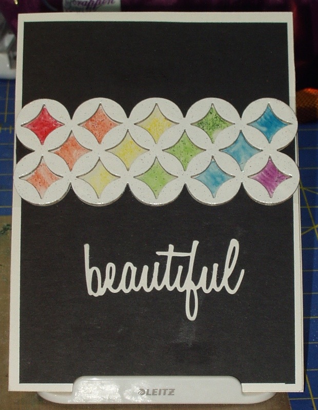
Since I'm still trying to play from stash, and to use things I have purchased but never used, I though I'd start with acetate sheets from Stampin' Up! which I bought more than 5 years ago. But I didn't want to make a card with it --- too fiddly and where does one hide the adhesive? So I decided it would be an accent on my card.

First I used the die "Courtyard" (657429) to cut a lattice from a piece of cardboard (the kind used in cardboard packing boxes). I was going to do two lattices but my Big Kick balked at teh second run so I settled for the first run. I painted the cardboard lattice three times with "Picket fence" Distress Paint to "Seal" it (I have issues with corrugated paper and with chipboard, soaking up the color and then not working how I want in the next step so I hoped this would help.). After the lattice had dried, I inked it with "Versamark" embossing ink and heat embossed it three times with Creative Beginnings regular "White" embossing powder.

Next, using the acetate  and  a scrap lattice that I have used as a stencil before, I painted in the openings with Distress Markers  in all the colors of the rainbow but Indigo (""Festive Berries", Ripe Persimmon", "Squeezed Lemonade", "Mowed Lawn", "Faded Jeans" and "Seedless Preserves")
-  I couldn't have fit Indigo in, anyway, even if I had a marker of that color! I wasn't sure if Distress Markers would work (they did color but wiped off easily) but I didn't have the range of colors in alcohol markers or StazOn inks so I figured it was worth a try. To keep the color from wiping off/smudging, I trimmed the acetate and taped it face down on a 5 x 7"  piece  of white cardstock. It smudged a little but now the colors are protected from wandering fingers! The embossed white lattice was then taped (using 1/8" ScorTape) on top of the acetate so that the color showed through the openings.

Next, I ran a piece of black cardstock through the die cut machine, again using "Courtyard". I put lattice aside and saved the uncut portions of card which I fit in on either side of the embossed white lattice (more ScorTape).

Finally, using a die from the "Adventure" Thinlits set (660224), I cut the word "beautiful" from white cardstock and, using collage glue, attached it to the black card below the lattice.

The entire front was attached to the front of my card:
Picture
You can't see the shine of the acetate/ink or the embossed lattice  in this photo but ti really adds some texture to an otherwise simple card.
0 Comments

Challenge - "Anything Goes"

5/27/2015

1 Comment

 
Another "Anything Goes" challenge, this time from Simon Says Stamp Wednesday, May 27, 2015. I'm not one for "playing" around in my craft space; I usually have a project in mind. But this time, I decided, let's see what I can do with a new stamp, my embellishment stash, and neutral Distress Inks... Kind of fits right in  with my tendency, io late, to go monochromatic!

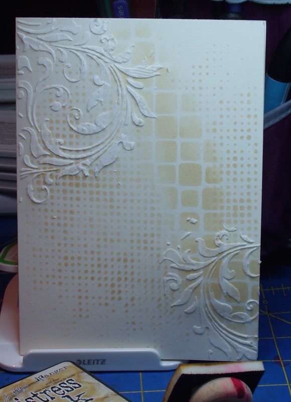
I started with a background on a prefolded "ivory" card:


Picture
I used three layering stencils: "tiles" (THS042) and "Dot Fade" (THS006) were applied using a blending tool and "Old Paper" Distress Ink. The "Flourish: (THS032) had Ranger Texture Paste applied in two locations on the card and allowed to dry.

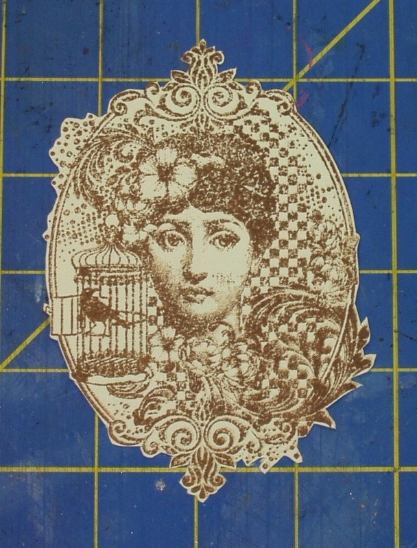
Meanwhile, I stamped a new stamp, "Miss Austen (Indigo Blu IND0102), in "Vintage Photo" Distress Ink on ivory card stock and fussy cut the image out:
Picture
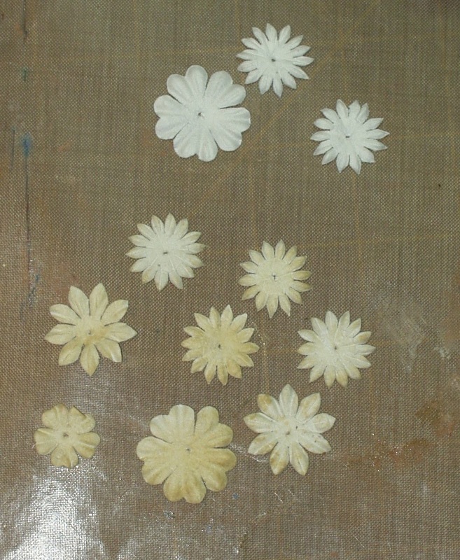
And I selected some paper blossoms from Petaloo's "color Me Crazy" mini-layers (#1543-000) and colored them with more "Old Paper" Distress Ink and a blending tool:
Picture
"Color Me Crazy" mini-layers, the top three uncolored, the bottom tinted with "Old Paper" Distress Ink
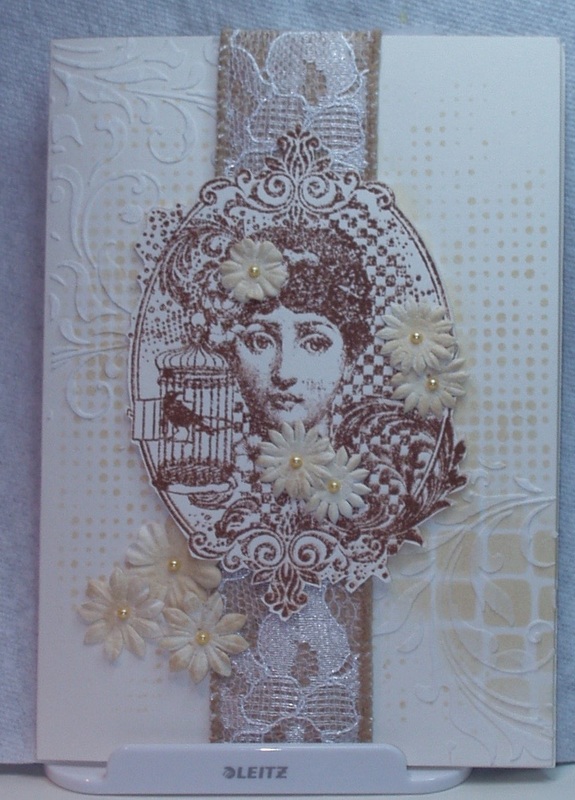
Time for assembly! First, I layered a length of Paper Studio Mixed Media wired ribbon ("Burlap Ribbon and Lace" down the middle of the card front. The I used foam dots, liberally applied, to layer the image on the card. Following that, I added a single "Daffodil" pearl (Memory Box Pearl Stickers)to the center to each of the blossoms and used Crystal Glaze to glue them, more or less randomly, to both the image; and tucked three more, larger blooms under the image to balance out the card...

Picture

No room for a message --- it could go inside, I suppose, and I do have a stamp that would work with the card front, but next time I try something like this, I will try either a tag, a canvas board or a burlap panel as this card turned out more "art" than "greeting card", in my opinion.

I rather like the way my monochromatic color scheme came out...
1 Comment

Challenge - "Thank You"

5/27/2015

0 Comments

 
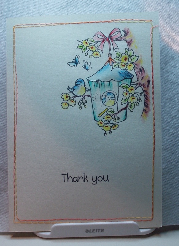
The Simon Says Stamp Monday Challenge for May 25, 2015 was to "get a jump on a few thank-you notes and gifts..." with "tags for store bought things [or] homemade thank you gifts, cards, or anything else" we can think of. I decided to go simple, given tie constraints this week and just make a one-layer thank-you card, which will join others in my box of cards for any occasion, in the event I need it on the spur of the moment - I have no specific Thank-yous to send at this time):

Picture
The image and sentiment are from the "Everyday in Moonbeam Meadow" stamp set by Crafter's Companion (a freebie from a Quick Cards magazine issue). I stamped both using Archival "Jet Black", and the colored the image using Inktense pencils ("Teal Green, 1300; "Apple Green", 114; "Sun Yellow" 02--; "Sea Blue". 1200; "Tangerine", 103; "Poppy Red" 0100; and "Madder Brown", 1920) and a detail water brush from Ranger. The border was stitched on my machine using a variegated (orange to yellow) cotton quilting thread.
0 Comments

Compendium of Curiosities Vol3, Challenge #29

5/23/2015

6 Comments

 
This series of challenges, based on the contents of Tim Holtz's book, Compendium of Curiosities, VOl. 3, is hosted by Linda Ledbetter from her blog Studio L3,  and she is assisted in this challenge by a design team of eight talented artists, two stores and the team of Tim Holtz and Mario Rossi II. Linda and the design team put together their interpretations of the bi-weekly challenges, the stores offer gift certificates for winners in alternating weeks (challenge #29 challenge is sponsored by Inspiration Emporium) and Tim and Mario have donated a cache of goodies form which another prize is assembled.

The rules are simple:
    •    One must work from the book and not reveal Tim's techniques (If you don't have the book, you can get one from Tim himself, autographed (!)... there 's still time as there are still a few  challenges left in this series!)
    •    You need to link your creation to Linda's blog
    •    You need to visit the design team's blogs and leave comments on their interpretations.

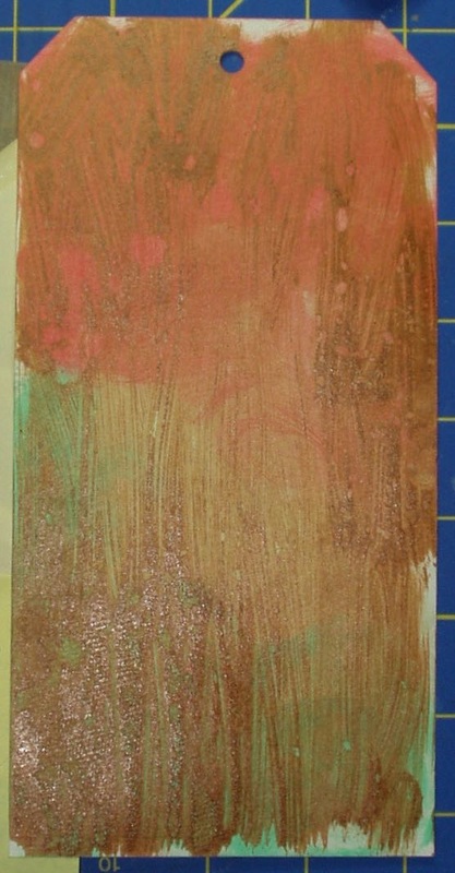
This week’s challenge is to implement the technique described on Page 44 of the book: “Eroded Metal”. I tired this technique using “Abandoned Coral”, “Cracked Pistachio”, “Old Paper” and “Antique Bronze” Distress Paints. I wasn’t totally satisfied as it looked more like wood grain than metal because I was having issued with covering without streaks:
Picture
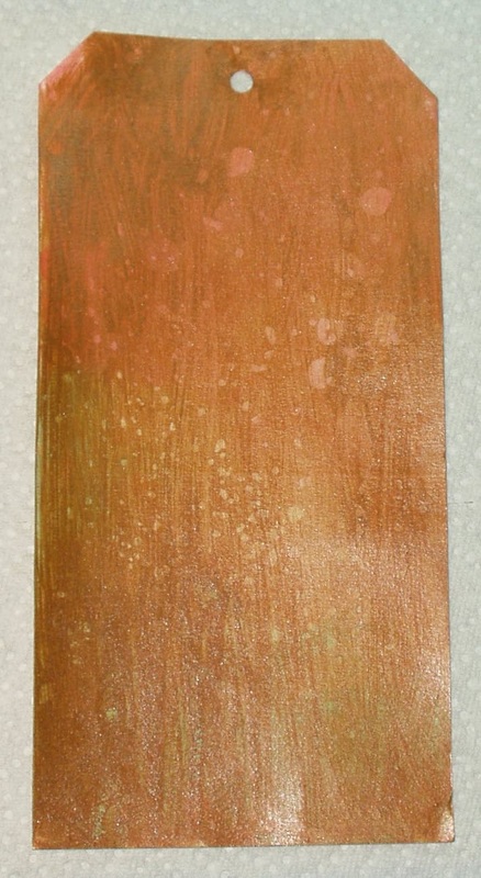
So I went online and looked for some tips and tricks to smooth out my metal and found a YouTube video called ‘“Very” Eroded Metal’ and tried again. A little better:
Picture
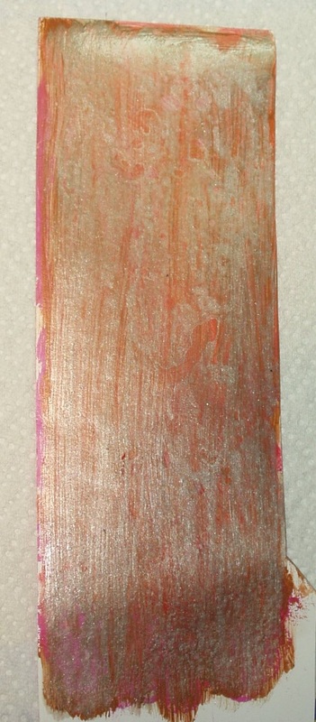
Then I thought, why not try the YouTube version with two colors of metal and recreated my first tag (using the matte back of a scrap of glossy white cardstock), blended “Vintage Photo” Distress Ink on the tag,  then added a layer of “Brushed Pewter” and did the technique again, followed by another layer of “Vintage Photo”:
Picture
Meh! Oh well, it looks like I don't have the touch.

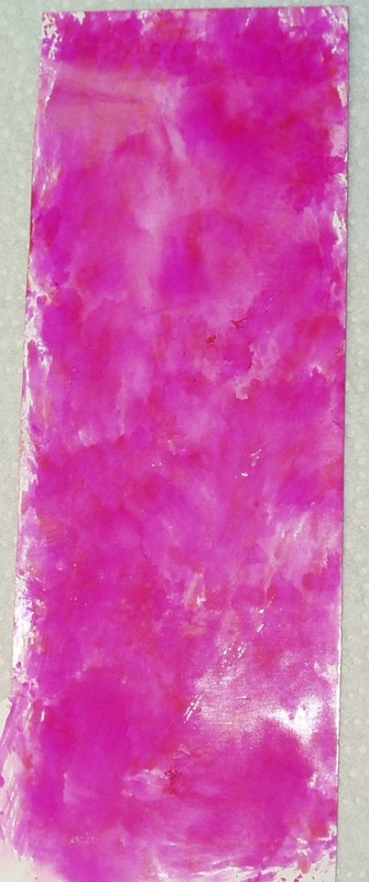
I did a marbled alcohol ink treatment on the glossy side of this variant, using “Raspberry”, “Watermelon” and “Shell Pink”:


Picture
As a rule, I am NOT a fan of hot pink, but when the alcohol ink treatment turned out the way it did, with the raspberry dominating, I proceed to search out more hot pink items from my stash…

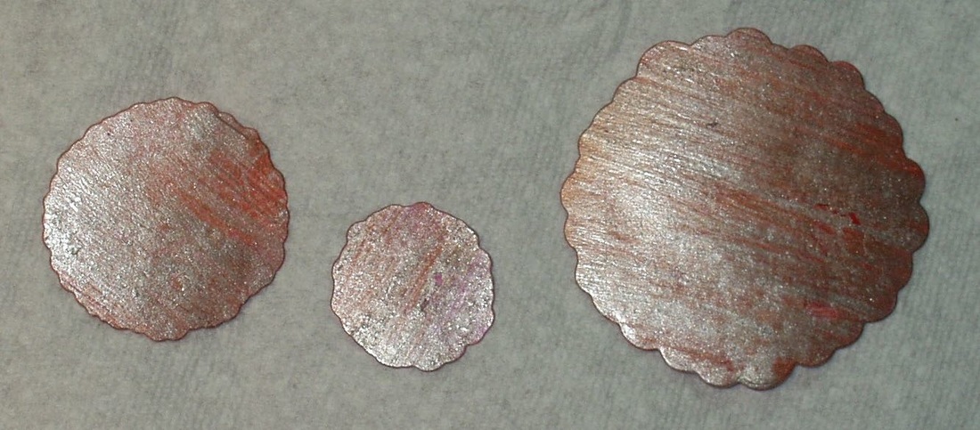
I die cut from the variant (two metallic/alcohol ink) sheet using a set of floral dies from Serendipity Stamps (#033 Flower Pops)”:
Picture
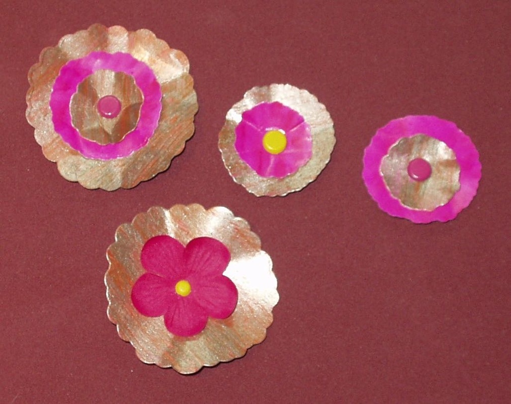
and shaped them (using the handle of a paintbrush - I couldn’t find my embossing tool set! It subsequently surfaced after I finished this tag - of course!) and layered them, attaching the layers with Hot Off The Press “Citrus” brads:
Picture
Not very floral flowers but…

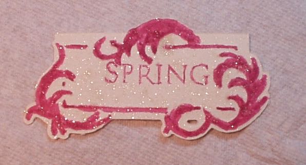
I then used the Cuttlebug Embossing Plus folder 2000251 (Fanciful Labels), a “Picked Raspberry” Distress Marker, A Hero Arts C3037 (“Spring”) and Sheer Shimmer spray to create a label:

Picture
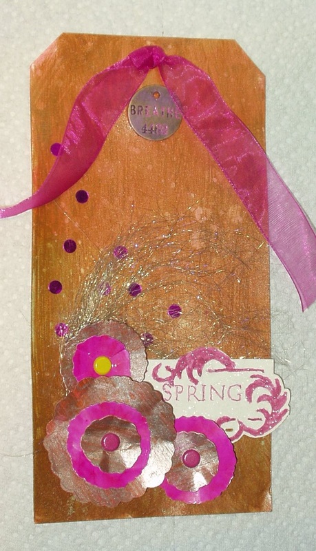
I then attached the “flowers” with foam dots; the tag with double-sided tape; a “sprig” of Gold Iris Angelina fiber  (which has been lurking in my stash for over a decade, untouched and unloved); a scattering of pink mylar confetti; and a philosophy disc (antiqued using “Picked Raspberry” Distress Paint). Final touch — a length of hot pink organza ribbon!

 
The result:
Picture
"Breathe! It's Spring!"
6 Comments

Challenge: "Stencil It!"

5/23/2015

1 Comment

 
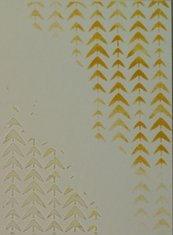
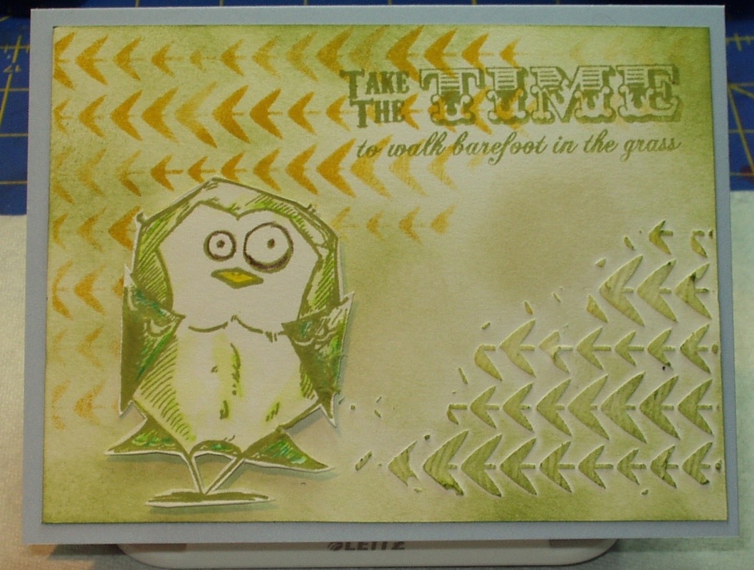
The Simon Says Stamp Wednesday Challenge for May 20, 2015, as explained by the design team, is to use one or more stencils in one or more ways (texture pastes, ink, paint, stamps, and/or ???) on a project . I am trying to pull out a different selection of tools, inks and papers each time I enter one of these challenges and this time, I went with the "Tracks" layering stencil (THS044). I stenciled through it with "Fossilized Amber" Distress Ink and a blending tool. I then moved the stencil to another part of my card front and applied Ranger's Texture Paste through it (notice that I apparently didn't clean my stencil very well as there is some "Fossilized Amber" tinting in some of the texture paste). This, then was my stencil application:
Picture
Now, this stencil isn't called "Tracks" for nothing (in my opinion, anyway). It sure looks like some birds were marching in ranks down the paper. So of course, I HAD to use one fo the "Crazy Birds" (CMS212). I stamped one of the birds in Archival "Fern Green" on white card stock and colored him with some of the Inktense pencils I was gifted with last Christmas. I used "Apple Green", 114 and "Teal Green, 1300, with a water pen to color the bird, "Sun Yellow", 0200, to color his beak, and "Madder Brown, 1920, to highlight his eyes. After he dried, I fussy cut out the bird.

Back to Archival "Fern Green" and a new set of Indigo Blue stamps ("Enjoy Life" EJ1). I masked off part of the sentiment, inked the top two lines and stamped over the Fossilized Amber tracks. I then used "Old Paper" and Peeled Paint" distress inks and a blending took to color in the background and darken the card front edges. Bird was attached using foam dots and the card front was attached to a prefolded blue card from Memory Box.:


Picture
"Take the Time to walk barefoot in the grass"
1 Comment

Challenge: Happy, Happy, Happy

5/22/2015

2 Comments

 
Frilly & Funkie's theme for May 20 was "Happy, Happy, Happy"! whatever makes you happy, they say. Sort of a wide-open theme, I suppose, but somehow, I felt a need to come up with something... and I did, in blue (I seem to be doing that a lot of late using monochromatic blues, but I also seem to use blue in my quilting and embroidery a lot too, so I suppose the color blue makes me happy...).

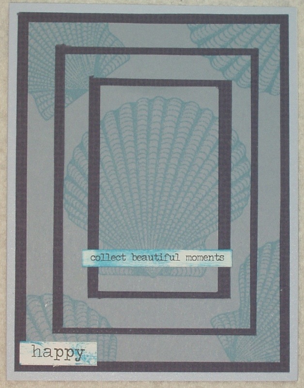
On of the happiest places I have ever been is Sanibel Island, Florida,  back in our college days (it's changed a lot since then, I fear). We were among the many who could be found on the beaches, doing the "Sanibel Shuffle" looking for a shell (or more) for our growing collection. So I decided to create a layered card using a scallop shell  stamp from JudiKins (2076G), two colors of blue card stock (from my scraps), a blue prefolded card by Memory Box, and two blue inks (Archival" Aquamarine" and Distress" Mermaid Lagoon").

I stamped the shell several times in "Aquamarine" on the lighter blue cardstock, layered it with the darker blue cardstock and added Idea-ology "Small Talk" and Big Chat" stickers which had been dragged through "Mermaid Lagoon" ink droplets on my craft sheet:

Picture
The layering technique is one shown to us this past week by Stacy Rich of Stacy's Stamps
Collecting beautiful seashells in a beautiful place is definitely collecting beautiful moments and as made me very happy in the past! I hope we can do this again someday soon!
2 Comments

Challenge: "X, Y, Z!"

5/22/2015

1 Comment

 
This was a toughie and I almost passed it by! Simon Says Stamp's Monday Challenge for May 18, 2015 was to create something with the theme of "X, Y. Z", be it the letters, or something that began with one or more of those letters. Aaargh! I didn't want to do Yellow --- I'd done several yellow challenges already this month! And I don't have any "zoo or "zebra" or "Xylophone" stamps or stencils or dies... and I sure didn't want to dwell on the end of anything BUT the alphabet! So... it would have to be letters! But how?

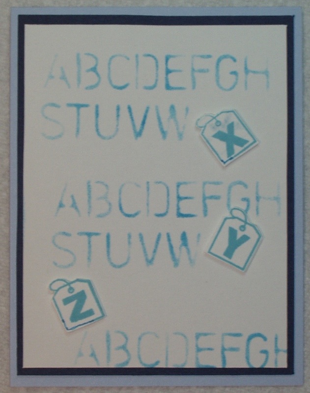
Well, as I was scrounging through my alphabet stamps, I stumbled on something I had totally forgotten I had: a set of Hampton Arts Stamps "Tag Alphabet" stamps on little blocks! Perfect! And I have one (count 'em, ONE - I really need to acquire more) alphabet stencil --- a freebie we were given at Create 2014 which contains a small version of Tim's alphabet along with bits of three or four other stencils.

For some reason, on these challenges, I seem to end up doing monochromatic and this time, it was blues. I had some Memory Box prefolded card blanks in a pale blue, some Bazill cardstock scraps in a darker blue, and two blue inks at hand (Archival "Aquamarine" and Distress "Mermaid Lagoon"). I stamped the three letters in "Aquamarine" in white card stock, touched them up with a "Mermaid Lagoon" Distress Marker, and cut them out. I stenciled all of the alphabet BUT the "x", "y" and "z" in "Mermaid Lagoon" on another piece of white cardstock. (stamping off my blending tool after each loading so the alphabet would be pale and somewhat blotchy --- I wanted my tag letters to be front and center). I then mounted the stenciled white card on the dark blue Bazill cardstock and adhered the three tag letters with foam dots in a "random" fashion (I don't do random well, sadly): The whole assemblage was attached to the prefolded blue card:

Picture
1 Comment

Frilly & Funkie Challenge: "Snap, Crackle, Crackle"

5/16/2015

1 Comment

 
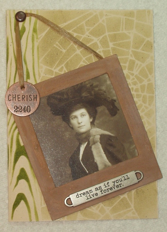
The Frilly and Funkie Challenge Blog (sponsored by The Funkie Junkie Boutique) issued a challenge in their May 13 post to create a card "with some cracks"! Now So out came my meager supply of crackle paints, some chipboard, some layering stencils, a Vintage Photo and my Distress paints and inks and I set about creating something with cracks. Easier said than done, I must say... I'm not a great fan of crackle paints (I never seem to be able to get them to crackle) but one shouldn't shy away from a product just because one is very good with it, right?

I have a "chipboard Collection" of various shapes and I selected a square frame, painted it several times with "Old Paper" Distress paint (to prime it, so to speak), let it dry and then applied a heavy coat of "Vintage Photo" distress Crackle Paint. I waited, and waited and waited --- no cracks! So out comes my trusty heat tool and I heated that frame to within an inch of it's little chippy life. Finally, some very fine crackle appeared. Typical. No matter how much "Old Paper" I rubbed over it, those cracks simply did not stand out, so you will have to take my word for it: the frame is crackled...

So I took my attempts to crackle one step further. I stenciled a "natural" card with "Old Paper" Distress Ink and the "Shatter" layering stencil (THS014) - after all, shattered is cracked, right? But there wasn't enough stencil to cover the entire card front so I edged the left side with "Peeled Paint Distress Ink (more cracks in peeled paint, right?) and the "Woodgrain" layering stencil (THS023).

I trimmed a vintage photo from one of Tim's "collections" to fit the frame and added a raffia tie, a Philosophy Tag and a Word Band to it and then adhered it to the card front at a "rakish" angle, "hanging" the raffia tie from a dark brown nail/brad!
Picture

1 Comment

Challenge:" Inspiration Color Swatch"

5/16/2015

2 Comments

 
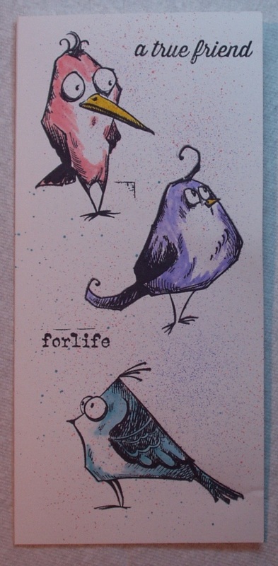
The Simon Says Stamp Wednesday challenge for May 13 was " ...choose one or more colors from the swatch, they don’t have to be Simon’s Brand, but please try to get a close match.". My color choices were the  darker pink on the left and the lighter blue second from the right. I used "Spun Sugar" and "Tumbled Glass" Distress Markers, respectively. They aren't exact matches, but I think they come close.

I wanted to use my "Bird Crazy" stamp set (CMS212).
I stamped the bird outlines and the sentiments on white cardstock with Archival Jet Black ink. One bird became "Spun Sugar" pink and a second became "Tumbled Glass" blue. To balance out the card, I colored the third bird in "Shaded Lilac". Beaks were colored in with "Squeezed Lemonade". The sentiments were selected from the SImon Says Stamp set "Hello You" (I only did the last three words of a four word phrase) and from the #Hashtags Set (CMS183) (using only the last two words of that phrase). Finally, using the Distress Marker Spritzer, I spritzed the card all over with "Spun Sugar", Tumbled Glass" and Shaded Lilac":


Picture
2 Comments

Challenge: Use Simon Says Stamp Product(s)

5/16/2015

0 Comments

 
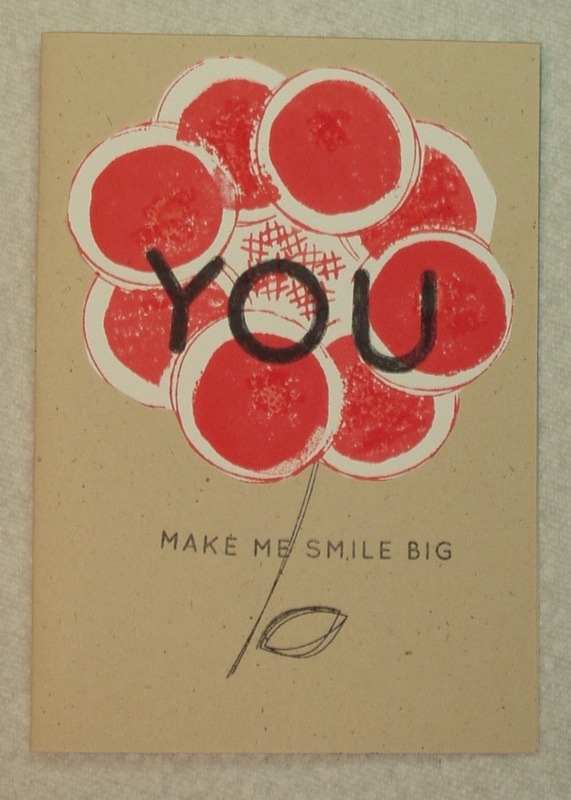
The Simon Says Monday challenge for May 11 was " Use any one Simon Says Stamp brand stamp, stencil, ink pad, cardstock, die, or kit on [the] project! It can also feature other things – just be sure to let [the DT] know what Simon brand exclusive product(s) [were] used ...".

Well, I wasn't sure I could do this one, since I didn't think I had any SSS products. However, on Wednesday, while sorting through several drawers of acrylic stamps and deciding they needed some sort of organization (I opted for alphabetical by designer/company), I came across two sets (Count 'em, TWO) of SSS stamps which I must have picked up at "Create 2014 last summer!SO I COULD do this challenge if I could only figure out how to use two such unrelated sets!

The first set was "Scribble Flowers" adn I decided to do as the name suggested, create a flower. And, like Topsy, it just grew! I stamped an flower petal outline on light-weight white cardstock, masked it and stamped more, until I had a flower with eight petals. Back to the masking, and this time using a solid filler petal, I filled each petal (ooops --- my mask bled a little). Then I used the little hash-tag like piece to create a center. All this is "Abandoned Coral" distress ink.  I used India Ink Black to stamp a stem and a leaf outline on a "natural" card base. I then fussy cut the "flower" and pasted it to it's stem. next, using more India Ink Black, I stamped words from the second set "Hello You" - the large "YOU" across the center of the flower and the smaller "make me smile big" across the stem.


Picture
0 Comments
<<Previous

    Author

    Born in New Jersey, I grew up in Southeastern Ohio. Attended university at Bowling Green State University (B.Sci  in biological science, 1964), University of Southern California (M. Sci in biological science, 1967) and University of Florida (Ph. D in zoology, 1971).
    Worked in environmental consulting for a little more than a decade and then seven years as an instructor in biological science at various community colleges in California and Texas. Moved to London in 1992, then Beijing (1996) and Saudi Arabia (1998), before returning to NW Ohio in 2002. I am currently living in NW Ohio with my husband and three Bombay cats.  I love to read (mystery, science fiction, history) and stitch (have done crewel, currently experimenting with free embroidery and needlepoint but blackwork and cross stitch are my main genres); have been known to knit; and now I'm heavily into papercrafting!
    Retired upon the return to the US so lots of time for our hobbies...

    Archives

    June 2023
    January 2022
    October 2021
    December 2020
    November 2020
    October 2020
    September 2020
    August 2020
    July 2020
    June 2020
    May 2020
    April 2020
    March 2020
    February 2020
    January 2020
    December 2019
    November 2019
    October 2019
    September 2019
    August 2019
    July 2019
    June 2019
    May 2019
    April 2019
    March 2019
    February 2019
    January 2019
    December 2018
    November 2018
    October 2018
    September 2018
    August 2018
    July 2018
    June 2018
    May 2018
    April 2018
    March 2018
    February 2018
    January 2018
    December 2017
    November 2017
    October 2017
    September 2017
    August 2017
    July 2017
    June 2017
    May 2017
    April 2017
    March 2017
    February 2017
    January 2017
    December 2016
    November 2016
    October 2016
    September 2016
    August 2016
    July 2016
    June 2016
    May 2016
    April 2016
    March 2016
    February 2016
    January 2016
    December 2015
    November 2015
    October 2015
    September 2015
    August 2015
    July 2015
    June 2015
    May 2015
    April 2015
    March 2015
    February 2015
    January 2015
    December 2014
    November 2014
    October 2014
    September 2014
    August 2014
    July 2014
    June 2014
    May 2014
    April 2014

    Categories

    All
    12 Tags Of 2015
    12 Tags Of 2016
    2018 Craft Space Clean-up
    All About ATCs
    Altenew
    Altenew Academy
    Art Swap
    Christmas Project
    Club Posh
    Compendium Of Curiosities
    Create 2014
    Create 2017
    Creative Carte Blacnhe
    Creative Chemistry 101
    Creative Chemistry 102
    Creative Chemistry 103
    Dina Wakely
    Dyan Reaveley
    Ellen Hutson
    Frilly & Funky
    Funkie Junkie Style
    Graphic 45
    Guest Designer
    Hero Arts
    #hipforsummer
    #holtzforhalloween
    #holtzfortheholidays
    Honey Bee
    InkRoad
    #Jennifer Mcguire
    Just Playing Around
    Lindy's Stamp Gang
    More Than Words
    OnLIne Card Class
    Seven Hills
    #sharewithsizzix
    Simon Says Stamp
    Stamptember
    Summer Of Creative Chemistry 2016
    Sunday Stamper
    Tim Holtz Kits
    WOW!

    RSS Feed

    Picture
    Picture
    Picture
    PAST PARTICIPATION

    Picture
    Picture
    Picture
    Picture
    Picture
    CHALLENGE BLOGS
    Simon Says Stamp Monday Challenge Blog
    Picture
    Picture
    Picture

    So proud!

    Picture
    for my August 2015 tag!
    for my entry into "Author, Author". October 5, 2016
 honored to be asked to be guest designer for Simon Says Stamp Monday Challenge, September 2017

for my entry in the Frilly and Funkie November 22, 2017 Challenge: Give Thanks
for my entry in the Frilly and Funkie December 9, 2017 Challenge: Most Memorable Gift
for my entry in the Funkie Junkie Boutique Blog Challenge, August 14, 2019 "Let’s Do It Again"

Online Card Classes

Picture
Picture
Proudly powered by Weebly