Now that I had the background, I didn’t have a tag suitable for incorporating it. I wanted the background to “shine” so I went with a greeting card this time.
This series of challenges, based on the contents of Tim Holtz's book, Compendium of Curiosities, VOl. 3, is hosted by Linda Ledbetter from her blog Studio L3, and she is assisted in this challenge by a design team which puts together their interpretations of the bi-weekly challenges.Two stores offer gift certificates for winners in alternating weeks (challenge #28 challenge is sponsored by The Funkie Junkie Boutique)and Tim Holtz and Mario Rossi have donated a cache of goodies form which another prize is assembled for the DT's choice.
The rules are simple:
• One must work from the book and not reveal Tim's techniques (If you don't have the book, you can get one from Tim ... there 's still time as there are a few challenges left in this series!)
• You need to link your creation to Linda's blog
• You need to visit the design team's blogs and leave comments on their interpretations.
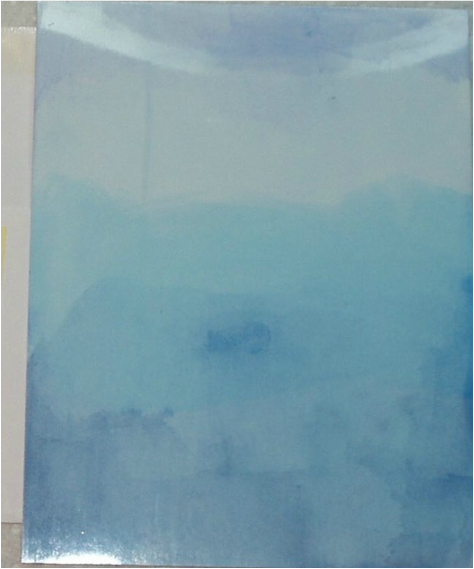
This week’s challenge is to implement the technique, "Alcohol Ink Ombre" as described on Page 57 of the book. I used the Ranger cardstock specifically designed for alcohol inks and alcohol inks “Stonewashed”, “Sailboat Blue” and “Denim” to create the effect per Tim’s instructions:
The rules are simple:
• One must work from the book and not reveal Tim's techniques (If you don't have the book, you can get one from Tim ... there 's still time as there are a few challenges left in this series!)
• You need to link your creation to Linda's blog
• You need to visit the design team's blogs and leave comments on their interpretations.
This week’s challenge is to implement the technique, "Alcohol Ink Ombre" as described on Page 57 of the book. I used the Ranger cardstock specifically designed for alcohol inks and alcohol inks “Stonewashed”, “Sailboat Blue” and “Denim” to create the effect per Tim’s instructions:
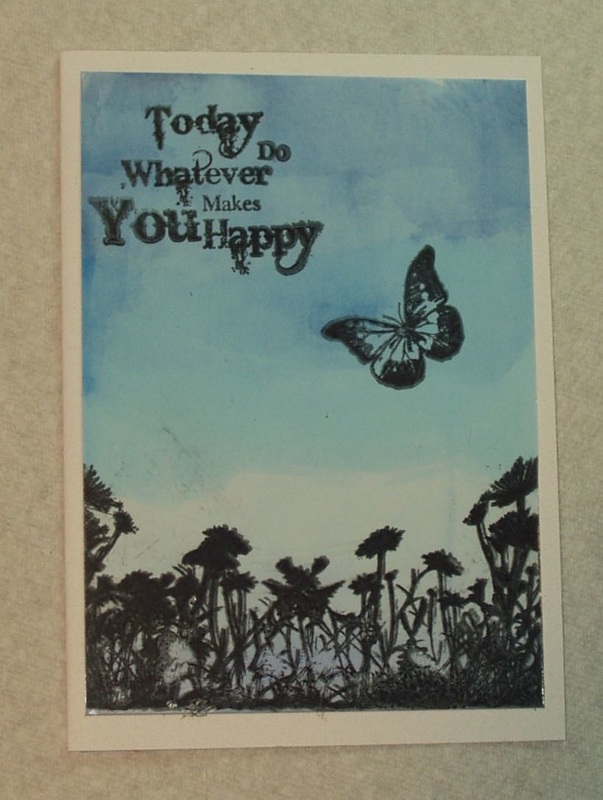
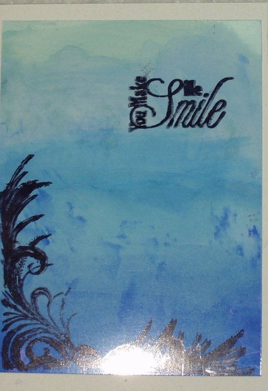
The ink used was India Ink Black and the stamp were from Sheena Douglas’ “A Little Bit of Scenic” Silhouette set (Immediate Media, Bristol, England, UK), a freebie set from “Quick Cards” magazine.
Sadly, I got a little “smear” on teh sentiment in that India Ink stamping so I thought I’d try again, this time with Archival Jet Black.
So I prepared two more card fronts in ombre, using Alcohol inks “Sail Boat Blue”, “Indigo” and “Cloudy Blue” on one and “Sail Boat Blue”, “Cloudy Blue” and “Stonewashed” on the other. I didn’t have the list with me of what color combination of inks I used the first time around so I guessed at the colors… and clearly, the combination matters: neither background came out as well as the first. But the stamping worked LITTLE better (still got some slippage, though)
The "Indigo" version is (Sorry for the glare from the lights in my work space)::
And using "Stonewashed":
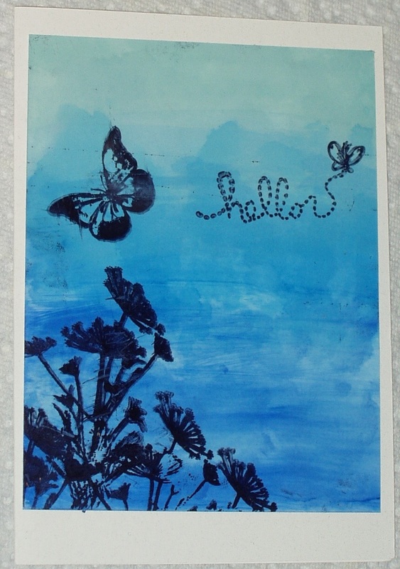
The sentiment on the stonewashed card is from a freebie set from “Quick Cards” magazine: Michael Abrams’ “Suomebunny to Love”.
I think I have come to the conclusion that I’m not a big fan on glossy card for stamping. Background, fine. Stamping, way to prone to slippage and blurring, at least for me. Otherwise, I like this ombre technique a lot and am thinking of trying different color combinations.
I think I have come to the conclusion that I’m not a big fan on glossy card for stamping. Background, fine. Stamping, way to prone to slippage and blurring, at least for me. Otherwise, I like this ombre technique a lot and am thinking of trying different color combinations.
 RSS Feed