The More Than Words mini-challenge for May 2019 is to make a card, postcard, tag or ATC focused on the word "Life". I opted for an ATC, using Washi Stickers and Prima flowers:
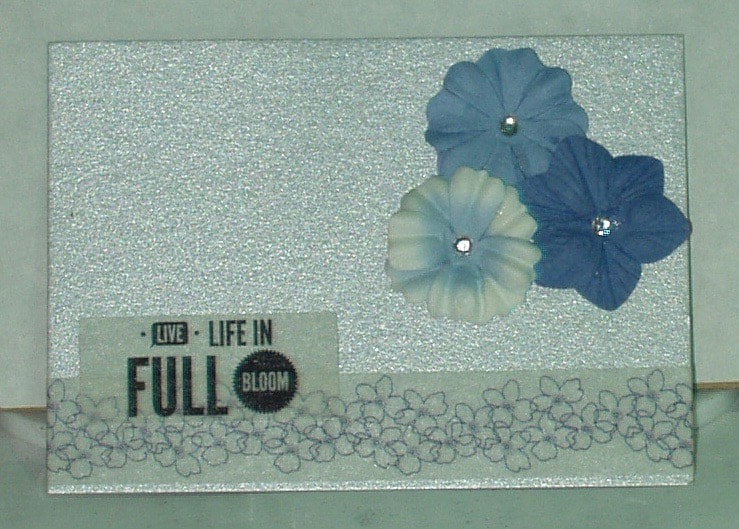
Products used in the making of this card were:
- Papers: Marco Papers Artist Trading Card color assortment pack
- Embellishments: Pink Fresh "Felicity" Washi Stickers (PFRC100816) and Prima flowers (640026)
- Adhesives: GInaK "Connect" glue


 RSS Feed