The photo takes a little away from the depth of the piece --- it really looks great lit up with that lantern and all that glitter (which is also all over my craft space now! My how that stuff travels!).
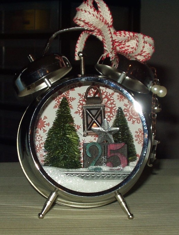
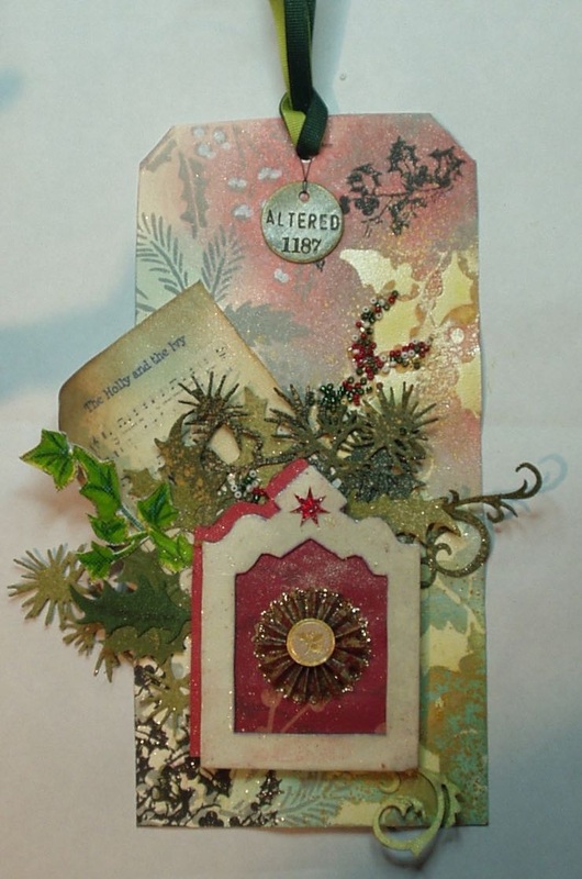
In November 2014, Tim Holtz put a kit for an assemblage clock onto his ETSY site which sold out i less than 4 minutes! I had been stalking that site for 24 hours and was one of the lucky ones to score a kit! It's been sitting in my craft space for the last few weeks, calling my name so, yesterday, when my friend Mary was busy crafting away on the table opposite me, and I had finally finished my Compendium of Curiosities 3 Challenge 16, I finally caved and got out the pieces and worked on the clock. I have to admit that I didn't follow all the directions exactly (I didn't have easy access to a power supply so I avoided use of a glue gun (which meant a lot of sticky fingers covered with layer upon layer of "Glossy Accents" while holding pieces together until the "glue" dried!) and had to trim a quarter inch off the big tree (because it kept toppling over when I inserted it in the clock!). Still, I do like how it turned out!
The photo takes a little away from the depth of the piece --- it really looks great lit up with that lantern and all that glitter (which is also all over my craft space now! My how that stuff travels!).
0 Comments
Linda Ledbetter of Studio L3 and her design team have posed Challenge 16 is all about using Layerings Stencils and heat embossing as shown on Page 50 of Compendium of Curiosities 3 (If you buy this book, you can see Tim Holtz's approach yourself.). This challenge is sponsored by The Funkie Junkie Boutique, who, along with TIm Holtz and Mario Rossi, are offering prizes to winders of this challenge. But even if one doesn't win a prize, one wins anyway just by entering: using Tim Holtz's prompts and ideas is a way to unleash one's curiosity and creativity! I'm loving this series of challenges! I started with a large tag and used the challenge technique on the right side with the holly bough stencil (THS 015), and sponged the tag with Fired Brick, Iced Spruce and Evergreen Bough Distress Inks. On the left side, I used the Festive stencil (THS 029) and iced spruce to create an overall pattern. I then touched up the holy berries on the iced spruce with dots of Picket Fence Distress Marker (I really like how it gave those holly bunches some dimension). I then overstamped with a holly stamp from Tim's Mini Christmas Collection collection, using Indian Ink Black. Finally, I spritzed it with Tarnished Bronze Distress Spray. Darn it, I really really like this background and don't ant to cover it up even a little but... needs must! Next I played with creating some embellishments, all holly related. First I used a chipboard frame, covered it with white cardstock and embossed three times with Versamark and clear embossing powder to give it some "presence". After sponging on some Fired Brick distress ink to tone down the white, I added a star sticker from K & Co. I then drop-shadow matted it with red cardstock. Behind the frame is a piece of patterned paper from a Christmas "stack"to which I added added another sticker from K & Co's Grand Illusions Stickers... I downloaded a thumbnail of sheet music for the carol "The Holly and the Ivy", mounted it to cardstock and antiqued it with Antique Linen and Vintage Photo distress inks. After curling the top left corner around a pencil, I mounted it to my background tag and began layering various cardstock colors (four shades of green) of dies cut form the "Festive Greenery" die which were then spritzed with Peeled Paint and Tarnished Brass distress sprays. The frame was glued over that.
Because the greenery and the frame all appeared to be heavy in the bottom left corner of the tag, I used some Crystal Glaze to create a "spill" to lead the eye up and to the right. Red, green, white and gold Czech glass #11 seed beads were pressed into the sticky glaze to add some visual interest. Two colors of green grosgrain ribbon were stung through the hole at the top of the tag and from the knot I hung an Idea-ology word disc. Then the entire tag was sprayed with Imagine Crafts Sheer Shimmer Spritz (which doesn't really show up well in the photo but does add quite a sparkle overall)! So here is the final product - "The Holly and the Ivy": Linda Ledbetter of Studio L3 and her design team have posed Challenge 15 is all about using Cabinet Card Pockets as shown on Page 38 of Compendium of Curiosities 3 (If you buy this book, you can see Tim Holtz's approach yourself.). This challenge is sponsored by Inspiration Emporium, who, along with TIm Holtz and Mario Rossi, are offering prizes to winders of this challenge. But even if one doesn't win a prize, one wins anyway just by entering: using Tim Hotltz's prompts and ideas is a way to unleash one's curiosity and creativity! I'm loving this series of challenges!
Today I took another of my husband's daylily photos, matted it on water color paper sprayed with Peeled Paint and Bundled Sage inks, and inserted it into an cabinet card pocket which I had distressed with sandpaper, stained with Vintage Photo, Old Linen and Peeled Paint stains (and a schmere of Old Paper distressed paint to cut theshine and reduce the "pinkish" look that the pocket had).. A few rub-ons and some gold accents form my Marvy Fine Line Liquid Gold pen finished the cabinet card pocket. But It seems a bit plain...and small! So I cut a large tag the size of the TIm Holtz stencils from white card stock, sprayed it with Peeled Paint distressed stain spray, added some stencil work (THS026 Gothic with Tarnished Brass distressed stain spray, THS021 Speckles with Peeled Paint distressed paint and THS016 Harlequin with Brushed Corduroy distressed paint) and some gold pen stripes and dots (most of which was covered eventually by the matted cabinet card pocket). I mounted the cabinet card pocket on a piece of royal purple card stock (again stenciled with the Gothic stencil and Tarnished Brass spray) and forest green card stock (distressed with VIntage Photo ink and striped and dotted with that gold pen). Added some left-over foliage from a previous project (sprayed with glimmer spray and antiqued with Brushed Borduroy distressed paint), two gold-embossed butterflies (Alterations stamp and die set 659884, versamark ink and gold embossing powder, maker label missing!), a black-embossed flourish (Hero Arts K5021, versamark ink and Craft Essentials black embossing powder) and a few more rub-ons. An "observations" plaque, stained with Old Paper distressed paint and attached with a forest green grosgrain ribbon finished my tag. |
AuthorBorn in New Jersey, I grew up in Southeastern Ohio. Attended university at Bowling Green State University (B.Sci in biological science, 1964), University of Southern California (M. Sci in biological science, 1967) and University of Florida (Ph. D in zoology, 1971). Archives
June 2023
Categories
All
PAST PARTICIPATION
CHALLENGE BLOGS
So proud!
for my entry in the Funkie Junkie Boutique Blog Challenge, August 14, 2019 "Let’s Do It Again"
Online Card Classes |