The stamps I chose naturally led me toward Halloween: Victorine Originals "Boarded Window" (2049K) and "Flying Bats (3047C). I chose a speckled navy cardstock to make a large tag and stamped two flights of the bats in Archival "Jet Black" I then stamped the bats again in "Jet Black" on a 1.5 inch circle (white cardstock, Paper Shaper Punch PSPWP01) and overlaid the circle on the background so it matched up with the previous stamping. I then stamped "Boarded Window" in "Jet Black" and colored it with Distress Markers ("Gathered Twigs", "Fossilized Amber", "Abandoned Coral", "Blue Print Sketch" and "Twisted Citrus") and a water brush. I fussy cut the window and glued it to the tag. Then I stamped two sentiments ("Treat" 3570B and "Halloween" 3569C fro the Penny Black "Halloween Night" set, 20 - o14) in Versamark and heat embossed with Comotion's Clear Top embossing powder ("Glowing Spring Green 161169 and Bright Tangerine Dream Orange" 161333). Final touch was a Jolee's by You "Pumpkin", altered with a bit of "Ripe Persimmon" Distress Marker" and Hero Hues patterned ribbon ("Foliage"):
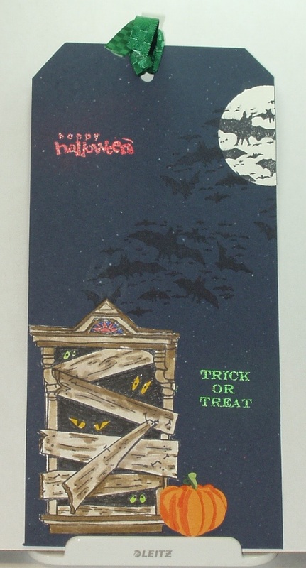
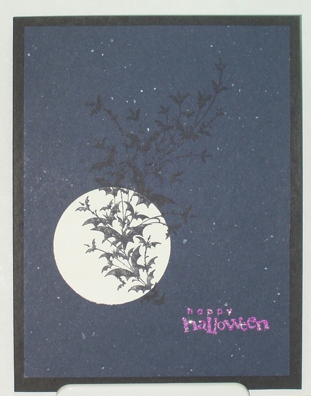
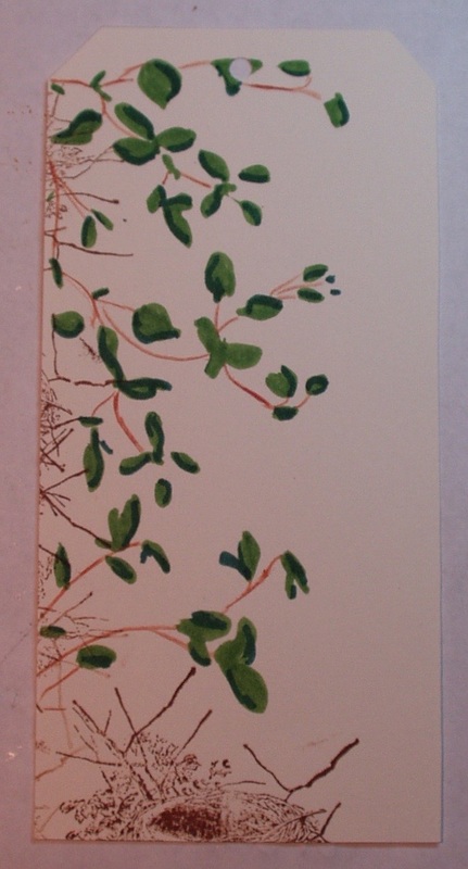
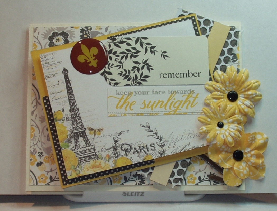
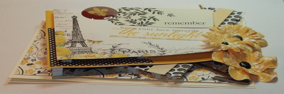
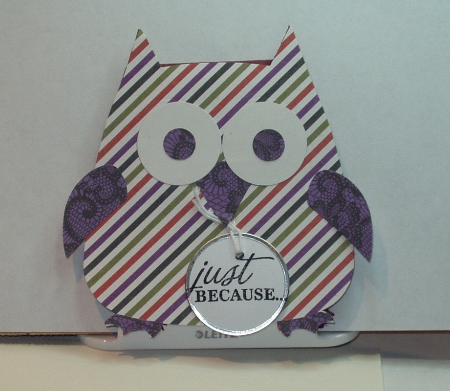
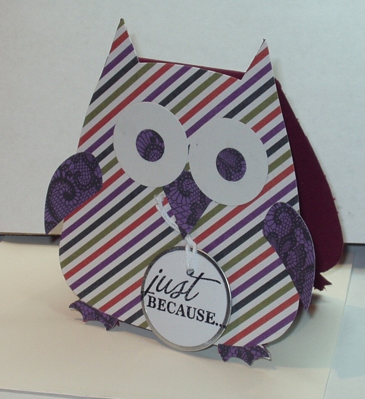
We have another "Anything Goes" challenge from Simon Says Stamp Wednesday Challenge, July 29, 2015. After experimenting with a small card, I decided to go with a tag that used stamping with black on navy cardstock. And it so happened that the sentiments I chose for this tag were form the featured company Penny Black!
The stamps I chose naturally led me toward Halloween: Victorine Originals "Boarded Window" (2049K) and "Flying Bats (3047C). I chose a speckled navy cardstock to make a large tag and stamped two flights of the bats in Archival "Jet Black" I then stamped the bats again in "Jet Black" on a 1.5 inch circle (white cardstock, Paper Shaper Punch PSPWP01) and overlaid the circle on the background so it matched up with the previous stamping. I then stamped "Boarded Window" in "Jet Black" and colored it with Distress Markers ("Gathered Twigs", "Fossilized Amber", "Abandoned Coral", "Blue Print Sketch" and "Twisted Citrus") and a water brush. I fussy cut the window and glued it to the tag. Then I stamped two sentiments ("Treat" 3570B and "Halloween" 3569C fro the Penny Black "Halloween Night" set, 20 - o14) in Versamark and heat embossed with Comotion's Clear Top embossing powder ("Glowing Spring Green 161169 and Bright Tangerine Dream Orange" 161333). Final touch was a Jolee's by You "Pumpkin", altered with a bit of "Ripe Persimmon" Distress Marker" and Hero Hues patterned ribbon ("Foliage"):
1 Comment
The Frilly & Funkie challenge for July 29, 2015 is to make a vintage or shabby chic card, tag, page, etc. showcasing something winged. The wings could be animal, fantasy or mechanical variety... I waffled about, looking for wings in my crafting space. I found insect wings of various kinds, a few birds, some flower fairies, one angel and an airplane or two. All winged. But none inspired me. Then, As I was moving from stamp drawer to stamp drawer, I stumbled across bats! Yes, bats --- winged mammals usually showcased in Halloween projects. Now this isn't anywhere near Halloween but... I went with the bats. And I went clean and simple, and maybe a little funkie... No real special techniques to share here. Just layered cardstock in black, a speckled navy, and a punched 1.5 inch circle from white. The stamp is a flying bat flourish by Inkadinkado (98695-P), stamped in Archival "Jet Black" and the sentiment is Penny Black's "Halloween" (3569C, from the "Halloween Night" set, 20-014) stamped in Versamark and heat embossed with Comotion's Clear Top embossing powder ("Bright Orchid Violet" #161331).
This was a test to see if stamping on black on that navy would work...I think it does --- subtle but there. The Simon Says Stamp Monday Challenge for July 27, 2015 is to “…use something other than regular patterned paper or cardstock…”, something including but not limited to specialty stamping paper to glitter, corrugated to extra heavy mixed media to tissue. Well, now, how about that! I have been playing around the past week, making a background on cardboard (the back of one of those free notepads you get so often in the mail with charitable solicitations). I follow Lindy’s Stamp Gang and, while normally the projects featured there are way beyond my little creative box (besides, I have very few of their product and what I do have, I have never tried! GASP!), I had seen a post where one of their design team had demonstrated a mixed media background, step-by-step. I decided to see if I could make something similar but using different products. I also skipped at least two steps and got a third out of order (oops!) but I sort of liked what I came up with and decided to use it as the base for a card. Here is how I went about making this card. First, I took the notepad backing and coated it with gesso tinted with “Abandoned Coral” Distress Ink reinker and, when that was dry, applied Wendy Vecchi’s Crackled texture Paste tinted with “Fossilized Amber” Distress Ink reinker. I let it dry overnight: Here is where I missed the two steps and got a third out of order... I sprayed the dried surface with “Festive Berry” Distress Spray and a little water and let the spray run into some (but not all) of the crackle.: As the texture paste dried, the cardboard buckled and started to peel at the edges, meaning I didn't really have to distress the end result! It did it all on it's own. But the curled nature od the card meant I'd have to get creative with adhering it to a base card --- so I eventually resorted to industrial strength reline tape. I used Versamark Ink and Top Boss “Gold” embossing powder and embossed a partial image from an Art Impressions background stamp (T-2022) on the left side of the card: followed by more Versamark, Personal Stamp Exchange “Claret Tapestry” embossing powder and a background stamp from Judikins (2400-J): I then matted my background on a claret-colored scrap of yardstick, added some silk flowers (maker unknown) and brads (Hot Off The Press “Citrus Creative”), a word band distressed with "Twisted Citrus" Distress Paint, and some orange Darice craft ribbon before adhering the entire piece to a folded ivory card. Product Used:
The Simon Says Stamp Wednesday Challenge for July 22, 2015 is to " use glitter, shimmer, gems, sequins, and whatever you like to make your projects SPARKLE and SHINE!". Not an easy challenge for me as I seem to be terminally "Bling Imparied"! But what are challenges for but to force one out of one's "box", right? After mulling over the possibilities for the past few days, I decided to try glitter, shimmery cardstock and sequins and see what I could come up with. First, glitter. Namely Distress Glltter in "Rock Candy" and "Spiced Marmalade". I've played with this before, not necessarily successfully, as I never seem to be able to get the stuff to STICK! I end up with a work space littler sparkling for weeks! Part of my issue, I believe, was the substrate I used (it would soak up the adhesive so quickly that there was little left to hold on to this relatiley bulky kind of glitter). This time I searched out some chipboard shapes which were already "sealed" with a coating of glossy paper. I had a box of Die Cut With A View "Fall Chipboard Alphabets & Shapes" and found two matching floral shapes in that box. I coated them liberally on their matching sides (a blotchy orange-red) with Glossy Accents and then sprinkled on Rock Candy Distress Glitter liberally. I let it sit for a few minutes before knocking off the excess. Then, a few hours later, when the glaze was fully dry, I added a spiral of Glossy Accents in the center of each flower and loaded that with "Spiced Marmalade" Distress Glitter: You can just make out the pattern of the paper through the Rock Candy, and I think the Spiced Marmalade, adn teh way it spread out into each petal, adds some visual interest to the flowers. Next step, add a sequin to the center of each flower. I used a mixture of orange sequins from a Doodlebug Design Inc. Rainbow Collection of sequins and more Glossy Accents: While all this Glossy accents was drying, I die cut a sentiment from a shimmery orange cardstock using the Thinlits die set "Adventure" (660224). I also stamped a corner of an ivory card with Hero Arts' "Flourish Corner" in "Ripe Persimmon" Distress Ink: Once everything was dry, I placed the sentiment (using Ranger's Collage Stick"), the glittered flowers (using foam dots), and a scattering of more Doodle Bug orange sequins (more Glossy Accents) to create an "all-purpose" card: Product Used:
The Simon Says Stamp “Work it Wednesday” challenge for July 22, 2015 is “Die-cuts! Show us your favorite card or project featuring die-cutting!” Well, how could I resist trying out my new “Bird Crazy” Thinlit dies” I started out with a large tag and a variation on the “Blossom” layering stencil (THS031) — I used an Intense pencil for the branches (“Baked Earth”, #1800) and two Distress Markers for the leaves (“Mowed Lawn”, “Pine Needles”) and omitted the “blossoms” altogether. The I stamped all around the tag edges with the nest from “Bird Feather” (CMS180), using “Vintage Photo” Distress Ink. I stamped the nest a second time, again using “Vintage Photo”, and fussy cut it… I used the Mini Blueprints #2 set (CMS146) and “Blue Print Sketch” Distress INK to stamp a blueprint of a nest! I distressed it with “Old Paper” Distress Ink and urged the corners. Next, I stamped two of the “Bird Crazy” birds (CMS212) in Archival “Jet Black” and watercolored them using a fine-tip water brush and Distress Markers (“Tumbled Glass”, “Faded Jeans”, “Squeezed Lemonade”, “Mustard Seed” and “Fossilized Amber”) and Distress Ink (“Vintage Photo”). After the birds dried, I used the new die cut set and then assembled my tag, spritzing with “Blue Print Sketch” Distress Marker before adding the wings and eyes to the birds. Now the reason for this tag is partly based on being addicted (in a bad way) to "House Hunters" in HGTV and partly from watching a male wren build nests in every single bird house in our garden (and we have a LOT of bird houses!), in hopes that a female wren will select just one of them!
So in this tag, the girl bird is looking at the blueprint and saying “But where are the walk-in closets, the hardwood floors, the granite counter tops, the stainless steel appliances…?” And the boy bird is saying, “With our budget, this is the best we can do and be move-in-ready! Can’t you just ‘embrace imperfection’?” Product used:
This series of challenges, based on the contents of Tim Holtz's book, Compendium of Curiosities, Vol. 3, is hosted by Linda Ledbetter from her blog Studio L3 and she is assisted in this challenge by a design team of eight talented artists, two stores and the team of Tim Holtz and Mario Rossi II. Linda and the design team put together their interpretations of the bi-weekly challenges, the stores offer gift certificates for winners in alternating weeks (challenge # challenge is sponsored by The Inspiration Emporium and Tim and Mario have donated a cache of goodies form which another prize is assembled. The rules are simple: • One must work from the book and not reveal Tim's techniques (If you don't have the book, you can get one from Tim.) • You need to link your creation to Linda's blog • You need to visit the design team's blogs and leave comments on their interpretations. This week’s challenge is to implement the technique described on Page 45 “Altered Surfaces.” I chose four of the “Alpha Parts - Framed” to experiment with and, following Tim’s instructions, altered their surfaces with “Abandoned Coral” and “Picked Raspberry” (the ampersand), “Cracked Pistachio” and “Broken China” (the question mark), “Old Paper” and “Iced Spruce” (the @ - I have no clue what this is called!), and “Antique Bronze” (the star): I also played with backgrounds using Yvonne Blair’s Acrylic Block stamping technique and tried out four backgrounds: I used the green tag on the left for another challenge and decided to use the yellow version (used “Antique Linen”, “Scattered Straw”, Mustard Seed”. “Wild Honey” and “Vintage Photo”) and the Antiqued Bronze star for my entry in this challenge. I plan on using the other two for other projects. Since I chose the star, I decided to use some of my older stamps that featured stars, and used India Black Ink to stamp (using masks) on the tag. I added some color variation on the “Star Angel” stamp (Stamping Ground 10024) by applying “Picket Fence” Distress Marker to the angel’s wings and Marvy Uchida Liquid Gold pen to selected folds of her robe. I then attached small gold star-shaped sequins to various spots on the “Swirling Stars” (Eureka! 585F) stamp. The Hero Arts “Playful Alphabet” set (LL763) was used to compose the title ”Star Catcher” and the Altered Surface Star was attached to the top of the tag using a piece of Affray satin ribbon. The quote that surrounds the “Star Angel” is as follows: “…Yearn’d to Burst the Folded Gloom; To Bare the Eternal Heavens Again; To Feel Once More in Placid Awe the Strong Imagination Roll A Sphere of Stars Above my Soul…” from Verse CXXII of “In Memoriam” by Alfred, Lord Tennyson. Here are some closeups of the tag the altered star: The Simon Says Stamp Monday Challenge for July 20, 2015, is to base the car on the letter “i”, whether it be the medium used (inks, ice resins, etc.) or the content portrayed. ! I know that this tended to lead me towards the old chant “You scream, I scream, we all scream for ice cream!”! But I didn’t want to do the “obvious” and, since I had recently purchased a selection of stamps from the French company “La Blanche" which portrayed an assortment of musical instruments, I decided to go with “i is for… Instruments!” I stamped four stamps on white cardstock in Archival “Jet Black” and fussy cut them with a card knife. For the violin stamp, a second stamping using “Vintage Photo” was done to provide for the properly colored instrument in the case. I then colored in the harp and trumpet with the “Fossilized Amber” Distress Marker and a fine-tip water pen. All four instruments were then attached to a distressed (“Old Paper” Distress Ink) ivory card base with the Ranger Collage stick and embellished with chitchat stickers and remnant rubs. Product used:
This is another “AnythingGoes” challenge from Simon Says Stamp Monday Challenge, July 13, 2015. I was having trouble with this one — nothing was inspiring me and I had three other challenges with specific themes to complete so I thought maybe I’d not enter this one. However, after completing two of the three outstanding challenges, I decided to play around with my stash and a tutorial I had seen recently online. It was called a waterfall card, but I think it’s more accurately a cascading accordion fold card. No matter the name, however. It turns out that I did have some cardstock already cut and scored from something done a year or two ago… They were in my scrap stash, probably because I think I cut them wrong. At any rate, they were the proper size and scoring for the tutorial. I pulled out a couple (one was eventually scrapped as a total failure) and started playing with stamps and inks to come up with my version of the Rubber Stamp Tapestry card. I didn’t have the stamps the tutorial used (although I did have some Rubber Stamp Tapestry peg sets that I'd never used) , nor did I have the inks used (or specified in the stamp set instructions) so I improvised. I used two Rubber Stamp Tapestry sets (“Waving Wildflowers” SFL34056, “Summer’s Gold” SFL34064), and six Archival Inks (“Leaf Green”, Fern Green”, and “Tiger Lily” from Wendy Vecchi’s Designer Series and “Vermillion”, “Aquamarine” and “Chrome Yellow”). I stamped one side of the card along the top margin and, when dry, fussy cut the top margin to create an irregular edge. I used the “Dragonflies At Dusk” (Rubber Stamp Tapestry, SBI08000) stamps and “Mermaid Lagoon” Distress Ink to randomly stamp different dragonflies in the white space of what would be the card interior. A wood-mounted Rubber Stamp tapestry stamp “Solid Leaf Vine” (42018-D) in “Leaf Green” was used to create a border along the interior bottom of the card, and a message was created using stamps from the Stampers Anonymous set “Botanical Sketch” (CMS216) and “Leaf Green”. I then stamped the reverse side on all panels except the one I planned to attach to a tag: The tag used Yvonne Blair’s Acrylic Block stamping technique with “Evergreen Bough”, “Iced Spruce”, “Forest Moss” and “Crushed Olive” Distress Inks, and was a spare tag created earlier for another challenge: I cut two slits in the card and threaded a ribbon scrap through from the back: I later found that the ribbon I had chosen wasn’t long enough to tie a bow so I swapped it out for some “Navajo Turquoise” polyester grosgrain (JoAnn CraftEssentials). I attached the accordion card to the tag with redline tape, positioned so that the ribbon could be tied around the card to keep it closed. I then attached a JustNan Silver Painted dragonfly charm (JNC15) with Crystal Glaze to the top of the tag, overlapping both the hole in the tag and the top of the accordion card: The final card closed: and opened:
Here's the challenge from the Frilly & Funkie Challenge for Wednesday, July 15, 2015: "Raise It Up!".. They want lots of layers, lots of panels and/or lots of elements on ashabby chic or vintage project, BUT they must be raised up! We can use pop dots, foam squares, silicone glue or another means of support, but we MUST make sure they stand tall! Well, I do layers, a LOT. And sometimes I even pop them up with foam dots or tape. So this looked like fun! There is a weekly sketch challenge on Split Coast Stampers which almost always uses layers in the sketch. I follow this challenge every week but have never done one of the sketches because they looked to "busy" to me...but this past week, the sketch (SC548) was right up my (and this challenge's) alley. So I pulled out my papers, my ephemera and my pop dots and got to work. After quite a bit of cutting and popping, this is what I came up with (the flowers are about as "Frilly" as I get...): Products used:
And just to prove that I did "raise it up!", a side view: No square or rectangular cards! That was the challenge posted for the Simon Says Stamp Wednesday Challenge, July 15, 2015. Not an easy project for me to tackle as I tend to re somewhat rectangular in orientation! However, I did have this die set I've been wanting to try for a while now and it seemed to me that it would fit the rules, IF I could make out how to use it as the card base instead of a card "topper"! Well, I came up with a way to do it (although a much easier way occurred to me as I was struggling to cut a prefolded card to shape with a craft knife... too late! well, I'll know how if this ever comes up again!) Here is my shaped card, basically a paper-pieced owl: Products used:
|
AuthorBorn in New Jersey, I grew up in Southeastern Ohio. Attended university at Bowling Green State University (B.Sci in biological science, 1964), University of Southern California (M. Sci in biological science, 1967) and University of Florida (Ph. D in zoology, 1971). Archives
June 2023
Categories
All
PAST PARTICIPATION
CHALLENGE BLOGS
So proud!
for my entry in the Funkie Junkie Boutique Blog Challenge, August 14, 2019 "Let’s Do It Again"
Online Card Classes |