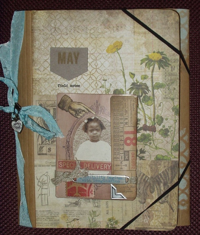
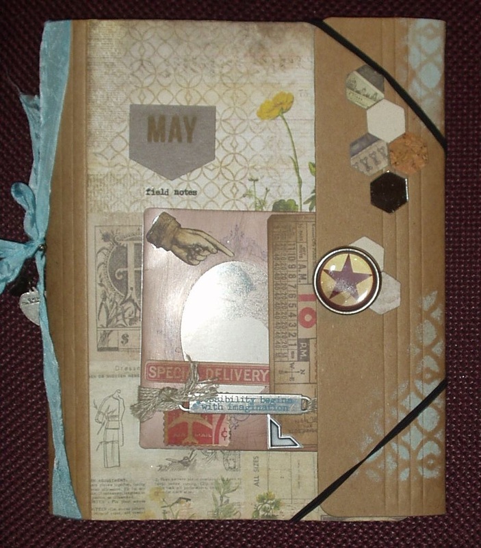
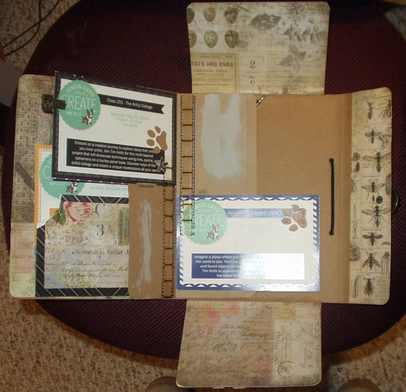
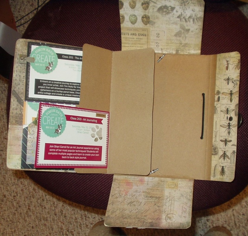
This was the last of the Tim Holtz classes at Create and it was pretty much complete when class was over. 
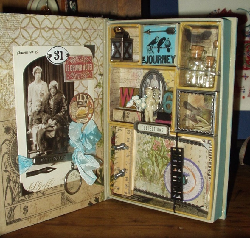
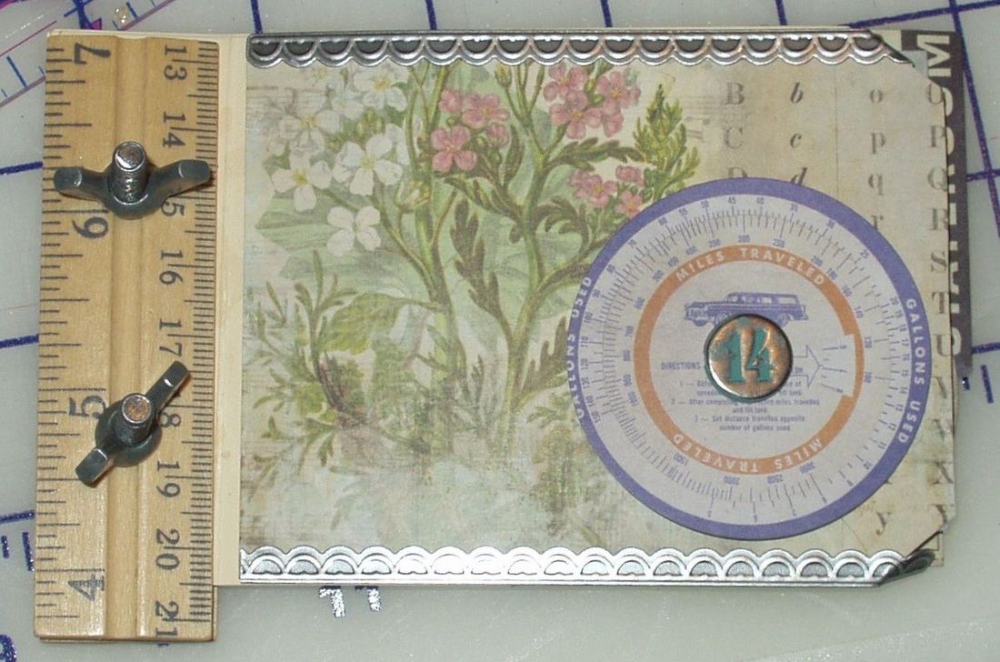
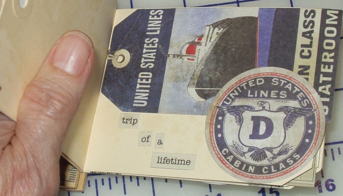
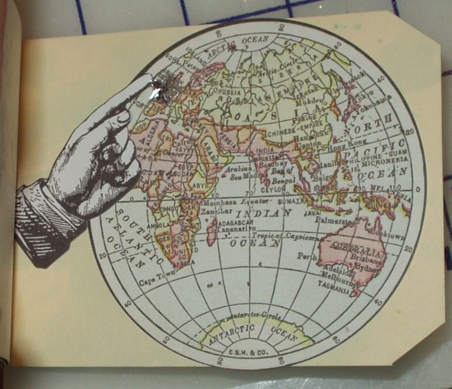
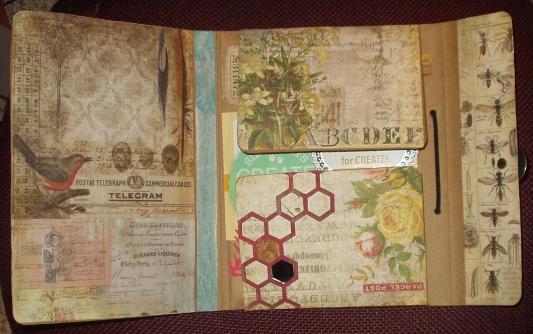
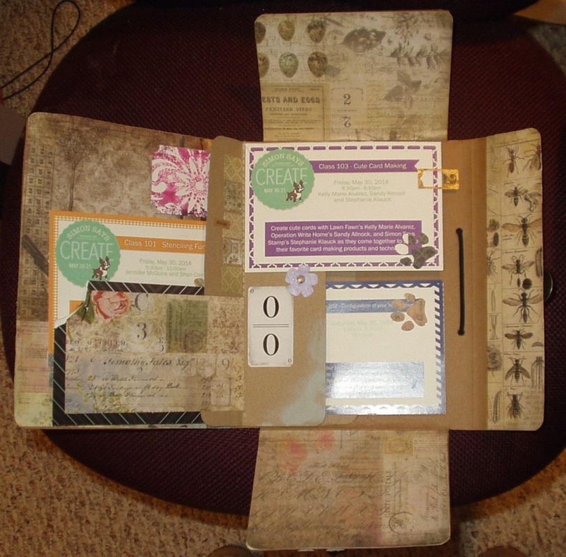
All that needed doing was final embellishment of the ruler/tag book in the lower right compartment. Since I had started out with something of a travel theme, I dug through all my "travel" embellishments to come up with the tags in the book. Not a lot of bling, but they do work with the theme and still leave room for photos or memories on the backs of tags...
0 Comments
This was basically complete at the end of class (the purpose of this exercise was primarily to introduce us all to the techniques to be used in the other two TIm Holtz classes) --- with only the flip cards in the inside not done. I added a rub-on title and a chipboard date piece to the cover and touched up some of the bare manila with Shattered Glass Distress Paint... Then I attacked the inside! I had decided back during the class that his would be my souvenir of the entire event (hence the title ":Field Notes" - although all the instructional handouts are now in their own notebook with samples of the cards where appropriate.) so I used the cards/ tickets for each class and embellished with Tim Holtz ephemera - I didn't get too heavy-handed because I wanted the piece to close (but even with one flip page unfilled, the piece is pretty much at capacity.) These tickets aren't distressed and so they don't really match the distressed look on the rest 0f the folio but I can get back to that later if it really bothers me. Mainly, I just wanted to get it DONE!
Only two more projects to go --- the ruler/tag book for the Tim Holtz shadowbox collection and the art journal pages for Shari Carroll's class on using gesso and !. Then it will be on to finishing up Creative Chemistry classes 1 and 2! I'm in catch-up mode! I pulled the class materials for the third class at Create 2014, "Cute Cards" taught by Kelly Marie Alvarez, Stephanie Klauk and Sandy Allnock. While I'm not usually a "cute card" maker, there were several techniques used in these cards that could be used in more edgy, less "cute" cards if I so wish. So, while it isn't likely I will copy any of these cards for future use, I will take advantage of what I learned in my card-making. Here are my "finished" versions of the cards from the class kit. Card #1 is the "Rainbow Dog" card, taught by Sandy Allnock, which employs a moveable cloud which could cover a greeting: Card #2 is "S'More", taught by Kelly Marie Alvarez, using a slider to move the squirrel and his marshmallow closer to the fire: Card #3 is "Balloon", a trifold card taught by Stephanie Klauk: Card #4 is "Bird on a Wire", taught by Sandy Allnock, which uses a border die in an unusual way: Card #5 is"Crabby", a shaker card taught by Stephanie Klauk (I used too many sequins so my stamp - not the crab used in the title - can't be seen...): Card #6 is "Bunny", taught by Kelly Marie Alvarez (this circular card is probably not assembled correctly. This was one card we never got to in the class so I had to create it from the instruction leaflet which left a little to the imagination): I had fun in this class. Sadly, there wasn't enough time to work at a leisurely pace which usually means I make some massive mistakes ("Bird on a Wire" should have more "YOU' stamps on it, too many sequins in "Crabby", etc.) but one learns form one's mistakes so, overall, it was a worthwhile experience that I might not have had if I had registered for the class on title alone!
Back in early June, I posted a photo of the only class I actually "completed" at the Simon Says Stamp Create 2014 event. The rst of the class pieces have sat in their carrier bags ever since, languishing in the shade of COmepnsium of Curiosities 3 Challenge. But a demo at our local stamp store, Bayer's Pampered Stampers, by a very good friend, about the use of stencils, got me thinking! I had six cards from the "Stencilling Fun" class at Create in various stages of completeness and it was time to get them DONE! So here they are --- not perfect by any means, and certainly not all like the examples in class (because I didn't have some of the products specified) but great reminders of a great class and some techniques I will be trying again! Card #1 is "Glitter & Stencils", taught by Jennifer McGuire (I didn't have the greeting stamp specified and used a different brand of glitter): Card #2 is "Embossing Paste & Stencils", taught by Shari Carroll: Card #3 is "Stamping with Stencils", taught by Jennifer McGuire (again, I didn't have the stamp specified in the materials list so I used a rub-on from Tim Holtz instead): Card #4 is Distress Ink & Stencils", taught by Shari McGuire (the glitter is a remnant from trying to clean up after the first card! Glitter gets EVERYWHERE!): Card #5 is "Embossing with Stencils", taught by Jennifer McGuire: and Card #6 is "Gesso Resist", taught by Shari Carroll (I had to shift the greeting slightly higher adn to the left to cover a massive "drip"...): What a fabulous, information-packed class this was, taught by two excellent teachers, and a perfect way to start the event! I'm SO glad I went!
This week, the challenge being presented by Linda Ledbetter at Studio L3 sponsored by Inspiration Emporium, is to use the Painted Industrial technique as illustrated on page 46 of Tim Holtz's Compendium of Curiosities, Volume 3. I went back to my "safe place: and made a card --- Using Tim's technique, the Sizzix embossing folder "Gears" (from the Blueprint and Gears set) and Black Soot Distress Paint, I made two two-inch bands of painted industrial foil tape mounted on light-weight card stock: I took a 6 x 6 piece of patterned paper from the Sweetly Chic Collection (of "Glimpses" by SImply Pink) and added ChitChat stickers (slightly altered as I couldn't find all the words I needed): Outlined the ChitChat words with a Black Soot Distress Marker and smudged the lines slightly, to create drop shadows.
And then I assembled the card , trimming the pieces to fit a 9.5" x 4" format, to get "Love Makes the World Go Round"! After all, gears do go round and round, right? This week, the challenge being presented by Linda Ledbetter at Studio L3 sponsored by the Funkie Junkie Boutique, is to alter a burlap panel as illustrated on page 37 of Tim Holtz's Compendium of Curiosities 3.
I just happened to have one of Tim's sets of small panels on hand and a lot of burlap embellishments acquired at time when I was into the color of burlap but never got around to using. To me, a color that works perfectly with burlap is orange (which also happens to be my favorite color) so I brought out my "Ripe Persimmon" Distress stain, paint, dye and marker and set to work altering the color of the embellishments as well as the panel itself. Incorporated in a rectangular panel from the set of four are an offcut of "Melange" tissue, burlap flowers from Paper Studio (some of which I stained with "Ripe Persimmon" stain), gold dots from CraftCardWorks Candi, a rhinestone buckle from Spare Parts, an Ideology framed word (from the Alpha Parts set, painted first with "Picket Fence" and then overpainted with "Ripe Persimmon") a butterfly sticker (from the Salvage Sticker book, colored in with "Ripe Persimmon" and "Rusty Hinge" markers), and a length of lace and selection of ribbons in shades of orange. Here is my "Study in Burlap and Orange": |
AuthorBorn in New Jersey, I grew up in Southeastern Ohio. Attended university at Bowling Green State University (B.Sci in biological science, 1964), University of Southern California (M. Sci in biological science, 1967) and University of Florida (Ph. D in zoology, 1971). Archives
June 2023
Categories
All
PAST PARTICIPATION
CHALLENGE BLOGS
So proud!
for my entry in the Funkie Junkie Boutique Blog Challenge, August 14, 2019 "Let’s Do It Again"
Online Card Classes |