Carol Stamps
  • Carol Stamps
  • Compendium of Curiosisties 3 Challenge - Gallery
  • Tim Holtz
    • 12 Tags of ...
    • Creative Chemistry 101
    • Creative Chemistry 102
    • Creative Chemistry 103
    • Summer of Creative Chemistry 2016
    • #hipforsummer 2017
    • #sharewithsizzix
    • #holtzforhalloween
    • #holtzfortheholidays
    • Share-a-Scare
    • Tim Holtz Christmas photo holder
  • Simon Says Stamp Challenges
    • Simon Says Create
  • Frilly and Funkie Challenges
  • Sunday Stamper
  • More Than Words
  • Creative Carte Blanche
  • Altenew
  • Seven Hills
  • Hero Arts
  • WOW! Embossing Powder
  • Graphic 45
  • Virginia's View Challenge
  • Dyan Reaveley classes, 2015
  • Just playing around
    • Art Swaps
    • Club Posh
    • Stencil Girl
    • Ranger Kits
    • Stamptember
  • Lindy's Stamp Gang
  • WOW! Challenges
  • Ellen Huston
  • OnLine Card Class
  • All About ATCs

Compendium of Curiosities 3 Challenge #14 - Color Crackle

10/27/2014

4 Comments

 
Page 53, "Color Crackle" is the subject of challenge #14 from the Tim Holtz Book, Compendium of Curiosities 3! This challenge is being hosted by Linda Ledbetter at her blog Studio L3 and sponsored by The Funkie Junkie Boutique.  A requirement of this challenge is to use the technique as described on the book, and, of course, to not reveal the technique (You should buy the book yourself if you are interested... it's worth every penny and Tim Holtz will even autograph it for you!).

For some reason, this piece didn't turn out as originally planned. It somehow morphed over the last few days into this tag, partly as a result of several steps not working out how originally planned. This is something new for me which I believe is resulting from participating on the challenge. I used to start a project with all my product and tools at the ready for a design I already had conceived in my brain and went from there. In the CC3C, I'm finding that when I start with a technique, things tend to go sideways and off on a tangent from whatever design I may have had in mind. I hope this is a good thing as it will help me "embrace imperfections" and let the design process flow more freely. 

At any rate, I covered the aspects that didn't quite work and changed direction. what resulted is this tag with color crackle flowers:

Picture
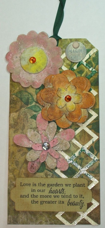
"Love is the Garden"
You can't see the crackle well in this photo but it is there--- just finer than I had wanted. I think the chipboard I used for the flowers absorbed a great deal of the crackle paint before drying, resulting in thinner layers than intended. I need to work on how to make that chipboard less absorptive!

Products used, in no particular order were:
  • Distress Paints: Worn Lipstick, Spun Sugar, Dried Marigold, Spiced Marmalade, Squeezed Lemonade, Scattered Straw, Old Paper, Peeled Paint, Shabby Shutters, Forest Moss
  • Crackle Paint: Clear Rock Candy
  • Distress Spray: Peeled Paint
  • Distress Inks: Vintage Photo, Antique Linen
  • Distress Markers: Walnut Stain, Forest Moss
  • Other Inks: StazOn Forest Green, India Ink Black, Versamark
  • Papers: Bazill pale olive green, 6x6 Collage Mini Stash
  • Adhesives: Ranger Collage Glue Stick, Multi Medium Matte, Glossy Accents
  • Embossing Powder: Creative Beginnings Clear
  • Gemstones: Darice Finishing Accents, Creative Craft Gems
  • and 8 precut chipboard flowers...

Tools used were
  • Stamps: Dylusions Doodle Parts DYR 34582, Seaside Stampin' Inc sentiment
  • Tim Holtz stencil THS019 Lattice Work
  • Tim Holtz Distres Spritzer
  • Frameworks Alterations "Lattice"
4 Comments

Compendium of Curiosities 3 Challenge #13 

10/17/2014

6 Comments

 
Page 35, "Worn Cover" is the subject of challenge #13 from the Tim Holtz Book, Compendium of Curiosities 3! This challenge is being hosted by Linda Ledbetter at her blog Studio L3 and sponsored by The Inspiration Emporium.  A requirement of this challenge is to use the technique as described on the book, and, of course, to not reveal the technique (You should buy the book yourself if you are interested... it's worth every penny and Tim Holtz will even autograph it for you!).

Again, I have a back story for this challenge. In June and July of this year, my husband planned to attend the national convention of the American Hemerocallis Society (daylilies for the uninitiated) in Asheville, NC. Since we have friends (ranging from daylily hybridizers to college buddies to former work colleagues) scattered along the East coast from South Carolina through West Virginia, it seemed a good time for a road trip with the convention as the centerpiece. Now I'm not an avid daylily person, and touring daylily farms wasn't high on my list of activities to participate in, but we could manage to fit in a lot of visiting, good food and visits to historic sights as well if we extended this trip to visit all our friends, so I signed on. It wasn't a cheap holiday, but it was an epic one --- nine states in 13 days!

I won't bore you with the details here (For a detailed description, check out my blog posts for June 25, July
2
and July 9) but I did collect ephemera and took photographs along the way, as is my wont. Usually, however, such collections end up in a manila envelope in a box somewhere and that is the end of it. But I decided to use this challenge to create a small souvenir book of that road trip.

Since there was no single technique to be used, the creation of the basic book cover should be pretty self-explanatory. The materials I used were:

  • Distress Inks ; Black Soot, Antique Linen and Vintage Photo
  • Distressed Embossing Powder - Peeled Paint
  • Distressed Markers - Gathered Twigs, Forest Moss, Peeled Paint and Squeezed Marmalade
  • Card Stock - Paper Stash 6 x 6 "Menagerie, Lasting Impressions "Gardener's Diary" and Bazil forest green
  • Remnant rubs - "Elements"
  • Stamp - All-in-One INR-032-7 ("Daylily")
  • Adhesives - Matte Medium and redline tape

Tools included the Frameworks "Trellis" and the Distress Marker Spritzer, as well as the usual craft knives, scissors, rulers, paint brushes and craft sticks!

Here is the front cover:
Picture
The label is cut from a page of a memo pad that was in the goodie bag at the convention, distressed with Antique Linen, spritzed with Gathered Twigs,  mounted on the forest green card stock and then detailed with a Peeled Paint marker.
Picture
The flowers are photos form my husband's daylily garden, printed in matte ink onto matte photo paper and trimmed to fit the cover.
Picture
Here is the back cover --- I kept it simple:
Picture
Here is the interior, which includes printed and distressed itineraries for the trip, to be used and a sort of index for what I intend to fill the book with. Again, I kept it simple since I plan to fill this book with pages and didn't want embellishments to interfere with that:
Picture
I created some blank pages which I will ink up at a later date and use, along with pocket pages,
Picture
to display the ephemera I gathered along the way:
which I will use, along with selected photos taken on the trip, to create the album. Much will need to be scanned, reduced, trimmed and otherwise altered to fit in this small album but I hope it will serve a a pleasant reminder of two weeks spent with very good friends!
6 Comments

Compendium of Curiosities 3 Challenge #12 - Distressed Photo TInting

10/2/2014

7 Comments

 
Page 41, "Distress Photo Tinting" is the subject of challenge #12 from the Tim Holtz Book, Compendium of Curiosities 3! This challenge is being hosted by Linda Ledbetter at her blog Studio L3 and sponsored by The Funkie Junkie Boutique.  A requirement of this challenge is to use the technique as described on the book, and, of course, to not reveal the technique (You should buy the book yourself if you are interested... it's worth every penny and Tim Holtz will even autograph it for you!).

Again, I have a back story for this challenge. Deep in the archives in our basement (that's a nice way to describe the chaos of stuff stored down there!) there is a photo album in progress that I started with old pictures of my family. Amng them is this photo of my maternal grandfather, PopPop (AKA WIlliam Edward Johnes) in his color sergeant uniform from the Spanish American War. At the time of this photo, he was approximately 22 years old:

Picture
Except for a very dodgy photocopy of an undated newspaper article about him, this is the only photograph I have of him. I never knew him as the vigorous young man he was in this picture: he had suffered from several massive strokes before I was born and I knew him only as a very stooped man who couldn't speak well and needed assistance to walk. But, according to the newspaper article, he was a master carpenter who worked on several major buildings in the area where he lived (a courthouse and a Christian Science Church among others), a volunteer fireman (a service he passed down to his grandson and great grandson as well), a member of the First Baptist Church (a real surprise as that side of the family, as far as I knew, was Methodist!), and a member of the American Eagle and the Zimmy Cycle Club (these were racing bicycles built in PopPop's home town, and as tall as PopPop was - well over 6 feet - I can't picture him on a racing bike, but...)! He was, when he died, the last of the Spanish American War veterans in the State of New Jersey (or so goes family legend). He had five children, four of whom survived him, and my Mother was his youngest! She resembled him quite a bit, in fact...

I had my husband copy the photo and print it onto photo paper and I tinted as per the instructions in Compendium of Curiosities 3, after researching Spanish American War uniforms to find the correct color (I settled on blending the closest distress inks I could find to "Cavalry Yellow" for the trim and opted to not try to put Army Blue over the dark jacket.).

I mounted the tinted photo on a fussy cut abstract flag, backed both with some navy cardstock, added some industrial numbers to indicate the date and a charm to represent what he meant to me, and then mounted the full assemblage to a lighter blue tag:
Picture
I stamped a sentiment on beige cardstock using Black Soot Distress Ink, fussy cut it and attached it to the tag using foam squares:
Picture
Finally, I attached a saying using Army Blue raffia and a foam square to hold it steady (I find raffia a little twisty!):
Picture
What resulted is perhaps a bit plain for the "Distressed" genre but I think it portrays what my PopPop meant to his family:
Picture
7 Comments

    Author

    Born in New Jersey, I grew up in Southeastern Ohio. Attended university at Bowling Green State University (B.Sci  in biological science, 1964), University of Southern California (M. Sci in biological science, 1967) and University of Florida (Ph. D in zoology, 1971).
    Worked in environmental consulting for a little more than a decade and then seven years as an instructor in biological science at various community colleges in California and Texas. Moved to London in 1992, then Beijing (1996) and Saudi Arabia (1998), before returning to NW Ohio in 2002. I am currently living in NW Ohio with my husband and three Bombay cats.  I love to read (mystery, science fiction, history) and stitch (have done crewel, currently experimenting with free embroidery and needlepoint but blackwork and cross stitch are my main genres); have been known to knit; and now I'm heavily into papercrafting!
    Retired upon the return to the US so lots of time for our hobbies...

    Archives

    December 2019
    November 2019
    October 2019
    September 2019
    August 2019
    July 2019
    June 2019
    May 2019
    April 2019
    March 2019
    February 2019
    January 2019
    December 2018
    November 2018
    October 2018
    September 2018
    August 2018
    July 2018
    June 2018
    May 2018
    April 2018
    March 2018
    February 2018
    January 2018
    December 2017
    November 2017
    October 2017
    September 2017
    August 2017
    July 2017
    June 2017
    May 2017
    April 2017
    March 2017
    February 2017
    January 2017
    December 2016
    November 2016
    October 2016
    September 2016
    August 2016
    July 2016
    June 2016
    May 2016
    April 2016
    March 2016
    February 2016
    January 2016
    December 2015
    November 2015
    October 2015
    September 2015
    August 2015
    July 2015
    June 2015
    May 2015
    April 2015
    March 2015
    February 2015
    January 2015
    December 2014
    November 2014
    October 2014
    September 2014
    August 2014
    July 2014
    June 2014
    May 2014
    April 2014

    Categories

    All
    12 Tags Of 2015
    12 Tags Of 2016
    2018 Craft Space Clean-up
    All About ATCs
    Altenew
    Altenew Academy
    Art Swap
    Christmas Project
    Club Posh
    Compendium Of Curiosities
    Create 2014
    Create 2017
    Creative Carte Blacnhe
    Creative Chemistry 101
    Creative Chemistry 102
    Creative Chemistry 103
    Dina Wakely
    Dyan Reaveley
    Ellen Hutson
    Frilly & Funky
    Funkie Junkie Style
    Graphic 45
    Guest Designer
    Hero Arts
    #hipforsummer
    #holtzforhalloween
    #holtzfortheholidays
    Honey Bee
    InkRoad
    Just Playing Around
    Lindy's Stamp Gang
    More Than Words
    OnLIne Card Class
    Seven Hills
    #sharewithsizzix
    Simon Says Stamp
    Stamptember
    Summer Of Creative Chemistry 2016
    Sunday Stamper
    Tim Holtz Kits
    WOW!

    RSS Feed

    Picture
    Picture
    Picture
    PAST PARTICIPATION

    Picture
    Picture
    Picture
    Picture
    Picture
    CHALLENGE BLOGS
    Simon Says Stamp Monday Challenge Blog
    Picture
    Picture
    Picture

    So proud!

    Picture
    for my August 2015 tag!
    for my entry into "Author, Author". October 5, 2016
 honored to be asked to be guest designer for Simon Says Stamp Monday Challenge, September 2017

for my entry in the Frilly and Funkie November 22, 2017 Challenge: Give Thanks
for my entry in the Frilly and Funkie December 9, 2017 Challenge: Most Memorable Gift
Proudly powered by Weebly