Carol Stamps
  • Carol Stamps
  • Compendium of Curiosisties 3 Challenge - Gallery
  • Tim Holtz
    • 12 Tags of ...
    • Creative Chemistry 101
    • Creative Chemistry 102
    • Creative Chemistry 103
    • Summer of Creative Chemistry 2016
    • #hipforsummer 2017
    • #sharewithsizzix
    • #holtzforhalloween
    • #holtzfortheholidays
    • Share-a-Scare
    • Tim Holtz Christmas photo holder
  • Simon Says Stamp Challenges
    • Simon Says Create
  • Frilly and Funkie Challenges
  • Sunday Stamper
  • More Than Words
  • Creative Carte Blanche
  • Altenew
  • Seven Hills
  • Hero Arts
  • WOW! Embossing Powder
  • Graphic 45
  • Virginia's View Challenge
  • Dyan Reaveley classes, 2015
  • Just playing around
    • Art Swaps
    • Club Posh
    • Stencil Girl
    • Ranger Kits
    • Stamptember
  • Lindy's Stamp Gang
  • WOW! Challenges
  • Ellen Huston
  • OnLine Card Class
  • All About ATCs

Challenge: Peridot

7/30/2016

0 Comments

 
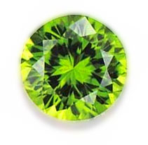
The Simon Says Stamp Work It Wednesday Challenge for July 2016 is to create something using the color(s) of the August birthstone - the peridot.  The blog provided a sample photo for guidance:
Picture
But since I have seed beads in the peridot range that don’t look at all like that photo, I looked the peridot up on ​ Wikipedia and it says that the colors of peridot range from a clear yellow through olive green to brownish-green; the “most valued ” is the rarer olive green shade but the most common color found in jewelry is the lime-green shade. 

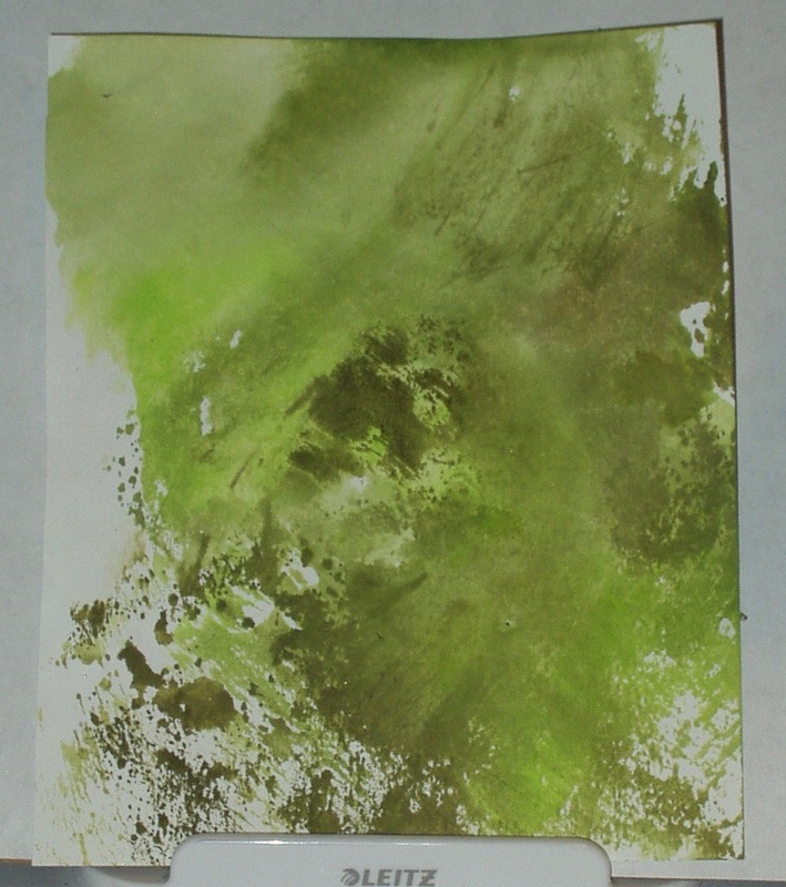
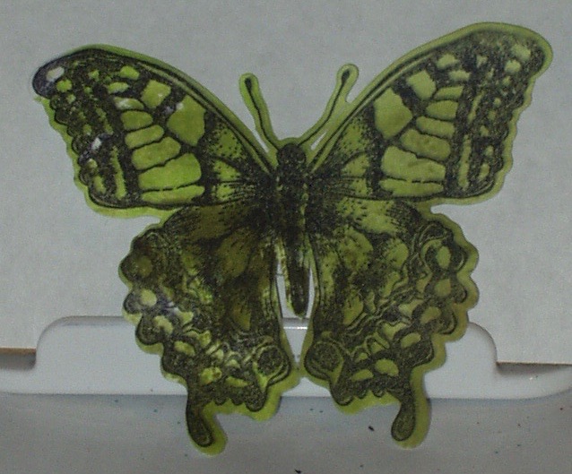
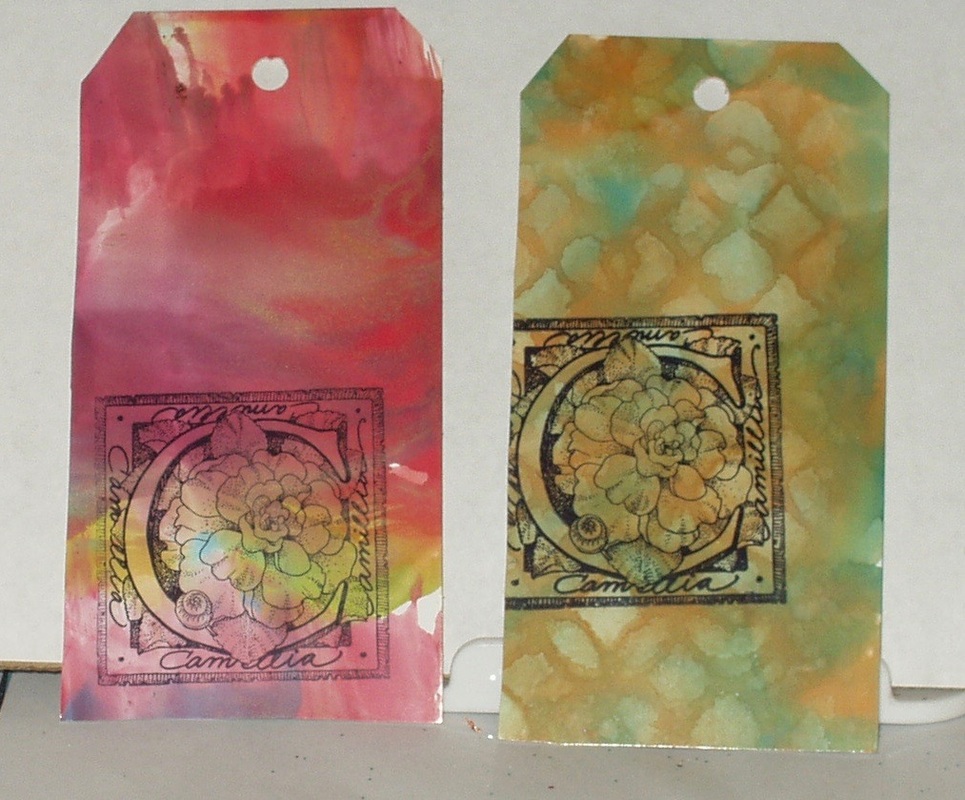
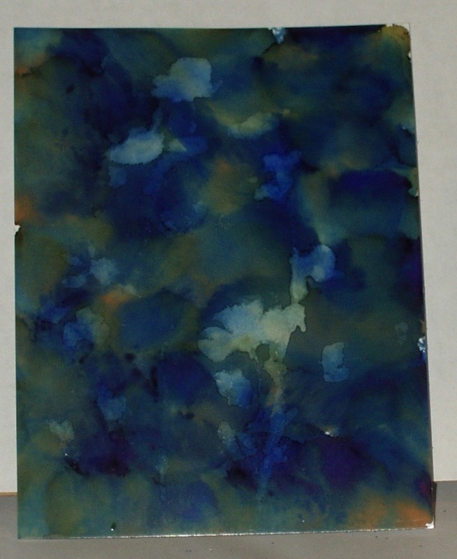
Not wanting to buck popular trends, I opted for three Distress Inks that, to me, represented the lime to olive green range: “Twisted Citron”, “Peeled Paint” and “Forest Moss”. I “smooshed” these three inks on my acrylic block, spritzed with water, and applied to some scrap white card to create a “peridot” color range from lime through olive:
Picture
I stamped a butterfly image on this colored card using Archival “Jet Black” ink
Picture
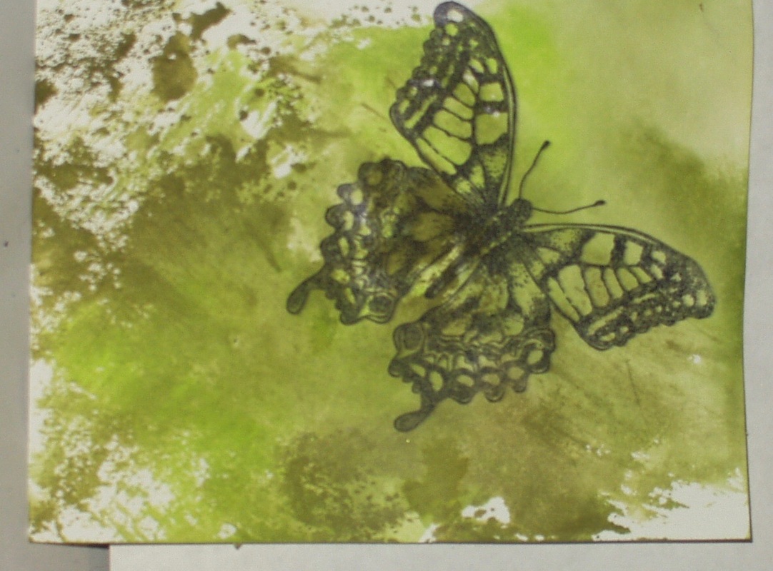
and then die-cut the image:
Picture
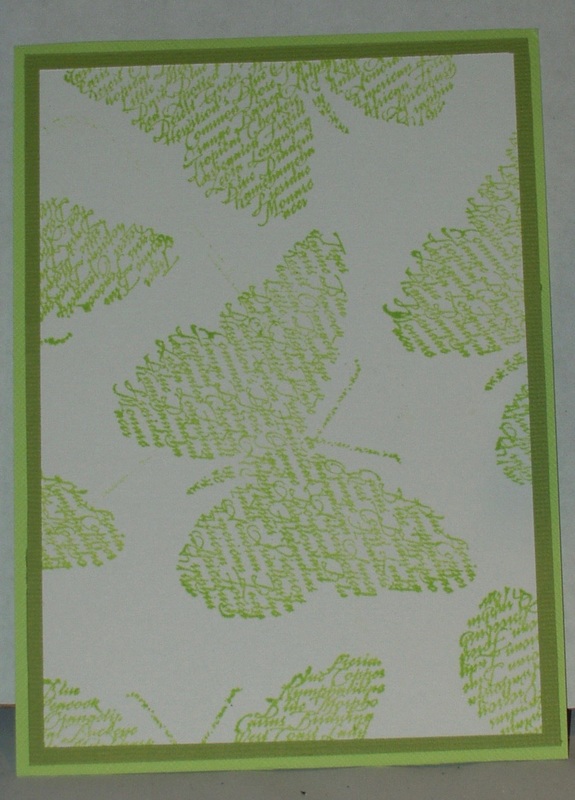
Next, I randomly stamped a butterfly “sentiment” stamp” on white card with the “Twisted Citron” Distress Ink and trimmed the card down to 4 3/4” x 6 1/4” and layered it on green card stock (as close in color I could get to the “Twisted Citron” and "Peeled Paint” colors.), resulting in a final card base of 4 7/8” x 6 3/4” .
Picture
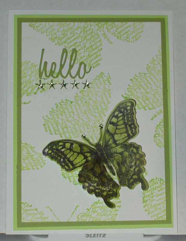
I die cut a sentiment from the “Peeled Paint” look-alike card after running a scrap through my Xyron 250 sticker maker. After dry-fitting the sentiment and butterfly image, I stamped a row of stars in “Peeled Paint” Distress Ink, adhered the sentiment above the row, and placed the butterfly below in the lower left of the card. The final touch  after adhering the card front to a pre-folded white card, was placing peridot rhinestones on each star and the butterfly antenna:
Picture
Products used in the making of this card were:

  • Stamps: My Sentiments Exactly “Butterfly Sentiment”; Sizzix Framelits “Limitations” (660189)
  • Dies: Sizzix Framelits “Limitations” (660189) and Thinlits “Friendship Words” (660225)
  • Inks: Archival “Jet Black”; Distress Inks” Twisted Citron”, “Peeled Paint” and “Forest Moss”
  • Embellishments: Heidi Swapp “bling”
  • Papers: The Paper Studio Value Pack” white”; Scraps of Bazzill green card (2 colors) and white card
  • Adhesives: Viva Las Vegas “Miracle Tape”; Xyron 250 Sticker Maker; Ranger Collage Glue Stick
0 Comments

Challenge: By The Sea (and Anything Goes)

7/27/2016

3 Comments

 
The Frilly & Funkie Challenge Bog challenge for July 27, 2016 is entitled “By The Sea”. Be it at the shore where we find sparkling sands, delicate shells and refreshing breezes, cruising on the sea , or exploring under the sea, they was a vintage or shabby chic project that features a nautical or beach theme and color palette.

I seem to be participating in a LOT of sea-themed challenges this month. There was the July 13, Simon Says Stamp Wednesday Challenge to “Create a Scene”, the Simon Says Stamp Monday Challenge for July 18 to be “Nautical/ By The Sea”, and my July entry in the Tim Holtz 12 Tags of 2016… 

While we live lakeside, it doesn’t quite cut it when it comes to the sea! I think it’s in my blood… As a child, we visited the Grandparents in New Jersey every summer and one of the highlights was going “to the shore” at Manasquan for the beach (and the seafood) or Asbury Park (for the amusement park) or Ocean Side (where my Aunt and Uncle and cousins had a summer cottage). I carried that love of the sea to when we lived in Florida (we used to camp on the beach near Jacksonville, did the Sanibel Shuffle on Sanibel Island looking for shells, drove the causeway to Key West, and took invertebrate biology field trips to Cedar Key and Seahorse Key), California (the beaches south of Los Angeles, north of San Diego and along San Francisco’s ocean shore are highlights, if somewhat colder than I like) and even Texas (Galveston Bay and South Padre Island, the latter in mid-winter…). Oh, and then there was that lovely picnic on the Sussex shore in England (in the rain, with cucumber and fish paste sandwiches with Tony and Rosemary), and walks on the strand at St. Ives in Cornwall or at Amalfi in Italy...I’m an ocean-side kind of gal, I guess.

But oddly enough, I don’t remember ever spending any time at lighthouses until we were in England (Cornwall to be specific, and then only at a distance) but that experience alone set me on a collecting spree of lighthouse-themed rubber stamps. I literally have DRAWERS of them! So I opted to go to my lighthouse stamp stash for this challenge and to use a pastel yellowish-tan, sea green and pale sea blue color palette. 

I stamped my lighthouse using Archival “Jet Black” ink on Specialty Stamping Paper. I matted the image off-center on sea green, yellowish-tan and pale blue papers. I colored it with Inktense pencils and a detail water brush, blotting between each color layer, and layered the card front onto a prefolded white card. The last touch was die-cut words (left over from when I made that July tag and couldn’t decided if I wanted to go with gold or blue!) in pale blue, overpainted with “Mermaid Lagoon” Distress Marker (so it would coordinate… and show up as well!) and outlined the words with a drop shadow of “Evergreen Bough” Distress Marker:
Picture
I’m also entering this in the Simon Says Stamp Wednesday Challenge for Jul 27, 2016 - Anything Goes  

Products used in making this card were: 

  • Stamps: Stamps Happen Inc “A Friendly Light” (80150)
  • Inks: Archival “Jet Black”; Intense Pencils “Poppy Red” (0400), “Baked Earth” (1800), “Ink Black” (2200), “”Sea Blue” (1200), “Teal Green” (1300) and “Antique White” (2300); Distress Markers: “Evergreen Bough” and “Mermaid Lagoon” 
  • Dies: Thinlits “Vacation Words - script” (661288)
  • Papers: Creative Memories Power Palette “Cabana Monochromes” and “Cabana Designer Papers”; The Paper Studio Value Pack “white”; Ranger Specialty Stamping Paper; scrap blue card 
  • Adhesives: Xyron 500 sticker maker; Viva Las Vegas “Miracle Tape”
3 Comments

Challenge: Add Some Texture

7/26/2016

1 Comment

 
On the Simon Says Stamp Monday Challenge blog for July 24, the design team suggests using corrugated card, embossing folders, pastes, gels, fabrics, etc.to add more texture to our projects. 

​I decided to go monochromatic with this one and play with the fabric scraps from my crazy quoting stash for texture. 

​First, I pulled some black card stock, trimmed it to fit my prefolded card front, and added some textured silver foil, frosted silver paper and grey-on-grey patterned paper to it in blocks. Then I applied black embossing paste through a layering stencil with a plastic knife (one of the picnic knives, with a serrated cutting edge) to add some pattern and texture:
Picture
I cut a two-inch-wide piece of black velvet studded with crystal, folded under the edges using double-sided tape, and then more tape to adhere it to the part of the tag not covered by the stencil: 
Picture
The border between the embossed card and the velvet looked a little "raw" so I added a string of clear crystal beads:
Picture
I set this piece aside overnight so the embossing paste would dry thoroughly.

The next morning, I dry fit my embellishments and cut my sentiment from white pearl card which I had run through my Xtron 250 sticker maker (my 500 is out of adhesive!).  I attached the sentiment to the card face and then added some silver-and-crystal brads, some velvet and lace flowers and a gem-studded black felt plaque to the card. The finished card face was added to the pre-folded card using double-sided tape. 
Picture
As you might have guessed, I had switched to a side-opening orientation after the dry-fit --- I had started out with a top-folding card orientation but it just didn't look right.
Products used in the making of this card were:
  • Papers and other media: textured black card stock, scrap frosted silver paper and white pearl card stock; scrap of black velvet with crystal embellishments; Grafix metallic foil; Memories Magenta Style "Mes Souveniers" paper (Acanthus Foliage BGROUND-77); The Paper Studio Value Pack "white"
  • Dies: Thinlits "Friendship oprds - script" (660225)
  • Stencils: Layering Stencil "Flourish" (THS032)
  • Embellishments: Paper Studio's Spare Parts "Antique Daisy" gem/flower/brads (803502); Prima Flowers "Madrigal Blossom White" (540128) and "Zephyr" (561123); Maya Road "Velvet Pleats Grey" (TK 1672)
  • Adhesives and other media: Dreamweaver Matte Black Embossing Paste; Viva Las Vega "Miracle Tape"; Xyron 250 Sticker Maker; Glossy Accents
1 Comment

Challenge: "Fun"

7/23/2016

0 Comments

 
The More Than Words blog has posted it's July mini-challenge for 2016. To enter, one must create a card, tag or artist trading card (ATC) prominently displaying the word "Fun" as part of the composition.

To make my ATC for this challenge, I used a number of dies that had just arrived in my mail to depict some "Fun in the Sun":


Picture
Products used in making this ATC were:
  • Stamps: Karen Foster Designs Snap-Stamps "Mini-Formal" (00377)
  • Inks: Distress Ink "Black Soot"
  • Dies: THinlits "Mixed Media" (660220) and "Tropical" (661207)
  • Papers: Miscellaneous scraps of blue, green, pink and lavender card; River City Blank Deck in glossy white and an ATC blank in yellow
  • Embellishments: Pearl Treasures #11.0 seed beads in "pearl"
  • Adhesives;Xyton 500 sticker maker; Glossy Accents; Ranger Collage Glue Stick
0 Comments

Summer of Creative Chemistry 2016 - Week 8

7/23/2016

0 Comments

 
In Week 8 of the Summer of Creative Chemistry 2016, we were to review the technique lessons for Days 3 and 5 of Creative Chemistry 102.

Day 3, Distress Differently, covered six varied techniques shown here on my practice tags: Smudge Stamping, Brayered Stains, Photo Tinting
Picture
I didn't have a real photo to tint so I used one of the "Found Relatives" For some reason, it took the red marker really well but rejected the blue...
Faux Cracked Glass, Distress Glitter Rock Candy and Distress Glittering
Picture
Day 5, Embossing Effects, covered six more techniques shown here on my practice tags: Rusting, Sticky Powder Glitter, Sticky Powder Leafing
Picture
I didn't have the right color of Distress Embossing powder for the Rusting" so I substituted "Shabby Shutters". The stamp I was using was too fine for the two Sticky Powder techniques so white there is glitter on the blue snowflake and the foil did stick to the gold one, I consider these three tags "fails"...
Shabby Chic, Tarnished Silver and Chalkboard
Picture
A little better luck here with Shabby Chic and Tarnished Silver but the Chalk was another fail...
Our challenge for this week of review was to use both distress inks and embossing powder. Given my lousy luck with the Day five techniques, I decided to go with Tarnished silver for my challenge tag. I used a chipboard piece from my stash. Scrap papers, die cut leaves and a butterfly were added to enhance the embossed frame: 

Picture
Products sued in making this tag were:

  • Stamps: Framelits “Limitations” (660189)
  • Dies: Framelits “Limitations” (660189) and Thinlits “Tropical” (661207)
  • Chipboard ra=rame: Joann’s Chipboard Pack
  • Inks: Distress Pain “Black Soot”; Distress Ink “Spun Sugar”, “Wild Honey”, “Tumbled Glass”; Archival “Jet Black”; Versamark
  • Embossing Powders: Creative Beginnings “Silver-regular”; Mark Enterprises Deep Impression “Clear”
  • Papers: scraps of green card and white card and patterned papers; #8 manila tag
  • Adhesives: Viva Las Vegas “Miracle Tape”; ranger Collage Glue Stick
0 Comments

Challenge: Things With Wings

7/21/2016

1 Comment

 
The Simon Says Stamp Wednesday Challenge for July 20, 2016 is “Things with Wings”. Birds, bees, butterflies, planes, whatever…

It seem like I have been doing a lot of “things with wings” lately, like a challenge for Creative Carte Blanch  which used a butterfly and dragon fly, and I also have done a few cards for Simon Says Stamp Monday Challenges using Holly Berry House scarab stamps (like the Challenges for March 9, 2015 and for July 11, 2016). But hey, beetles are a great winged beastie and so I’m using another Holly Berry House scarab in this challenge 

First, i stamped a collage beetle stamp from A Stamp in the Hand in Archival Ink on a scrap of alcohol ink ombre on glossy white card  that I had in my stash. I matted the trimmed image on two coordinating colors of blue card and mounted the piece on a pre-folded white card. 

Next, I stamped a Holly Berry House scarab on a scrap of a third color of blue card using Distress In. I  spritzed it with Pssst! Sheer Shimmer spray and edged it with a Distess Marker after fussy cutting it. (You might be able to make out some of the shimmer in this photo):
Picture
I stamped a Quintessential Quote stamp in Archival ink on the same scrap blue card, mounted it on a darker blue and fussy cut that as well:
Picture
I assembled the card using double sided tape and foam dots:
Picture
Products used in the making of this card were:
  • Stamps: Dylusions “Quintessential Quotes” (DMK34490); Holly Berry House “Small Scarab” (160SI); A Stamp in the Hand “Beetle Collage” (B-1933)
  • Inks: Distress Marker “Faded Jeans”; Distress Ink “Stormy Sky”; Archival “Jet Black”; Psst! Sheer Shimmer spray “Sparkle” 
  • Papers: Scrap alcohol ink ombre on glossy card; scrap 3 shades of blu card; The Paper Studio Value Pack “white”
  • Adhesives: Viva las Vegas “Miracle Tape”; EK Tools 3-D Foam Dots
1 Comment

Challenge: Nautical/By The Sea

7/18/2016

2 Comments

 
The Simon Says Stamp Monday Challenge for July 18, 2016 is “Nautical” or “By the Sea”. According to the design team, “Summer is here and what nicer place to be than down by the coast! Whether you enjoy a boat trip out on the open waves or maybe you prefer to dip your toes in the sea while enjoying a refreshing ice cream. Which option do you prefer to use for your inspiration?… Although we do accept all styles this really is the challenge to get out your inks and paints and have a go at a more mixed media, artsy style. The main thing is to stretch your boundaries and  have fun!”

Well, I chose to represent “By The Sea” from a fish’s point of view.

First, I created a background using pale blue card, “Tumbled Glass” Distress Ink and a background stamp from Heather’s Stamping Heaven:
Picture
I was aiming for a low contrast, subtle evocation of waves.

​Next,  I stamped a deep sea scene using “Salty Ocean” Distress Ink on white card stock and a Paper Parachute stamp. I mounted this scene on very light blue card stock and metallic gold card stock:


Picture
Finally, I stamped the Paper Parachute image in Archival “Jet Black” on white card stock and then watercolored the focal image, a fish,  with Distress Markers and a golf finalize pen. A touch of Glossy Accent to the eye was the final touch to my fish, which I fussy cut…
Picture
I used dies from the Sizzix “vacation” script die set to cut the words “By The Sea” from metallic gold card which was previously run through a Xyron 500 sticker maker. Assembly of the card included attaching the fish to the matted image using foam dots and then attaching the matted image to the background with double-sided tape. The phrase was next and the final touch was some green gems for the bubbles form the fish’s mouth. The entire construct was then attached to a pre-folded white card:
Picture
Products used in the making of this card were:

  • Stamps: Heather’s Stamping Heaven HSH2758 and Paper Parachute 1992-2000
  • Inks: Archival “Jet Black”; Distress Ink “Salty Ocean and “Tumbled Glass”; Distress Markers “Cracked Pistachio”, “Broken China”, “Mermaid Lagoon”, and “Peacock Feathers”; Snowman fine-line “gold”
  • Dies: Sizzix “vacation” script (661288)
  • Papers: The Paper Studio Value Pack “white”; scraps of pale and light blue and white card, metallic gold card
  • Embellishments: Hero Arts “Hero Hues Gems” (green, CH160)
  • Adhesives: Xyron 500 sticker maker; Vival Las Vegas “Miracle Tape”; EK Tools 3D foam dots; Glossy Accents
2 Comments

Summer of Creative Chemistry 2016 - Week 7

7/15/2016

0 Comments

 
Week Seven of the summer of Creative Chemistry focuses on Day 4 of Creative Chemistry 102: Alcohol Inks. The techniques demonstrated in that class (and my sample tags): Faux Patina (A fail for me); Tarnished Tinsel (another fail) and Ombre (didn't work out really well either):
Picture
Monoprint and Faded Layers (I had better luck with these):
Picture
Since my success was limited with the test tags, I went with the technique that came out best for me of rtes challenge - to use any of the techniques shown. I selected "Faded Layers" (but I really need to learn to select my colors better --- the "Indigo" and "Oregano" were definitely too dominant in the final result:
Picture
Still, the faded areas from the "Wildflower" layering stencil do show up a little. I decided to mirror these wildflowers with Archival Ink and the new "Mini Bouquet" stamp set:
Picture
but the contrast was too low so I doodled with a fine-line gold pen on the stamped images to make them stand out a little...
Picture
Products used in making this tag were:
  • Stamps: "Mini Bouquet" (CMS264)
  • Stencils: "Wildflower" (THS035
  • Inks: Archival "Jet Black"; Ranger Alcohol Inks "Willow", "Oregano", Indigo" and "Sunset Orange":, Ranger Alcohol Ink Blending Solution
  • Papers: Ranger Glossy Card; # 8 Manila Tag
  • Adhesives: Viva Las Vegas "Miracle Tape"
0 Comments

Challenge: All Lined Up

7/14/2016

2 Comments

 
Frilly and Funkie Challenge Blog, July 13, 2016, wants us to get “All Lined Up”.  We are to use straight lines, be it rows or columns, stripes or grids, horizontal of vertical, so long as lines are a clearly visible part of our project!

Time for me to play with some “stripe” stamps that have been in my stash for ages!. I created background in Distress “Vintage Photo” on a sand-colored card scrap using three of the stripe stamps in a Stamping’ Up! set called “Perfect Plaids”. I then stamped over these stripes with another Stamping’ Up! stamp from the “Still Life Stem’s set, using Archival “Jet Black”. I watercolored the flowers with Distress markers and matted the image on coordinating red and sand-colored card. I die cut a phrase from Gold metallic card using my new Sizzix “vacation script” dies and this card is the result:
Picture
Except of the colors, this reminds we of the wildflowers popping up on the roadsides around here…

I’m also entering this ins the Simon Says Stamp Wednesday Challenge: Create a Scene 

Products used in the making of this card were 

  • Stamps: Stamping, Up! “Two Step Stamping’ Perfect Plaids” and “Still Life Stems”
  • Inks: Archival “Jet Black”; Distress Ink “Vintage Photo”; Distress Markers “Peeled Paint”, “Twisted Citron”. “Abandoned Coral”, “Spiced Marmalade”, “Candied Apple” and “Dried Marigold”
  • Dies: Sizzix “vacation script” (661288)
  • Papers: The Paper Studio Value Pack “Ivory”. scraps of red, sand, and metallic gold card
  • Adhesives: Viva Las Vegas “Miracle Tape”; Xyron 500 sticker maker
2 Comments

Challenge: Create a Scene

7/14/2016

0 Comments

 
Over at Simon Says Stamp Wednesday, the challenge for July 13 is to “Create a Scene”. Not to act out I assume (although I could do that very well when I dropped my magnetic platform on my foot!) , but to make a card with a scene or scenery. My first thoughts turned to my collection of lighthouse stamps. definitely a starting point for a scene, don’t you think?

I searched my little cabinet of lighthouses and found a selection of stamps that would add to the scene. I selected one of my lighthouses that was situated the way I wanted and added in a stamp with some seascape features.
Picture
A little masking, a few black pen strockes here and there, some watercoloring, and some color coordinated matting, and here is what I came up with as  a scene.
Picture
I die-cut some suitable words in colors that matched the mats and came up with a finished card:
Picture
Maybe the water is never this blue off Cape Hatteras (I’ve never been there and it looks a little tropical to me) but it works for me!

Products used in making this card were: 

  • Stamps: PSX “Cape Hatteras Light” (K-2774) and Coronado Island Stamping ‘seascape” (demo, not for sale — no idea how I got this!)
  • Inks: Archival “Jet Black”, Distress Markers “Antique Linen”, “Tumbled Glass”, “Pumice Stone”, “Cracked Pistachio”, “Mermaid Lagoon”, “Evergreen Bough”, “Fossilized Amber”, “Yumbled Citron”, Spiced Marmalade”< “Wild Honey”, “Fired Brick”, “Peeled Paint”; Signo UM-153 “white”; Pigma Micron 05 “black”
  • Dies: Sizzix “vacation script” (661288) and “VACATION block letters” (661287)
  • Papers: The Paper Studio Value Pack “ivory”, Scraps of Antique White, Sand and Pale Aqua card stock
  • Adhesives: Ranger Collage Glue Stick; Viva Las Vagas “Miracle Tape”, and Xyron 500 sticker maker
0 Comments
<<Previous

    Author

    Born in New Jersey, I grew up in Southeastern Ohio. Attended university at Bowling Green State University (B.Sci  in biological science, 1964), University of Southern California (M. Sci in biological science, 1967) and University of Florida (Ph. D in zoology, 1971).
    Worked in environmental consulting for a little more than a decade and then seven years as an instructor in biological science at various community colleges in California and Texas. Moved to London in 1992, then Beijing (1996) and Saudi Arabia (1998), before returning to NW Ohio in 2002. I am currently living in NW Ohio with my husband and three Bombay cats.  I love to read (mystery, science fiction, history) and stitch (have done crewel, currently experimenting with free embroidery and needlepoint but blackwork and cross stitch are my main genres); have been known to knit; and now I'm heavily into papercrafting!
    Retired upon the return to the US so lots of time for our hobbies...

    Archives

    December 2019
    November 2019
    October 2019
    September 2019
    August 2019
    July 2019
    June 2019
    May 2019
    April 2019
    March 2019
    February 2019
    January 2019
    December 2018
    November 2018
    October 2018
    September 2018
    August 2018
    July 2018
    June 2018
    May 2018
    April 2018
    March 2018
    February 2018
    January 2018
    December 2017
    November 2017
    October 2017
    September 2017
    August 2017
    July 2017
    June 2017
    May 2017
    April 2017
    March 2017
    February 2017
    January 2017
    December 2016
    November 2016
    October 2016
    September 2016
    August 2016
    July 2016
    June 2016
    May 2016
    April 2016
    March 2016
    February 2016
    January 2016
    December 2015
    November 2015
    October 2015
    September 2015
    August 2015
    July 2015
    June 2015
    May 2015
    April 2015
    March 2015
    February 2015
    January 2015
    December 2014
    November 2014
    October 2014
    September 2014
    August 2014
    July 2014
    June 2014
    May 2014
    April 2014

    Categories

    All
    12 Tags Of 2015
    12 Tags Of 2016
    2018 Craft Space Clean-up
    All About ATCs
    Altenew
    Altenew Academy
    Art Swap
    Christmas Project
    Club Posh
    Compendium Of Curiosities
    Create 2014
    Create 2017
    Creative Carte Blacnhe
    Creative Chemistry 101
    Creative Chemistry 102
    Creative Chemistry 103
    Dina Wakely
    Dyan Reaveley
    Ellen Hutson
    Frilly & Funky
    Funkie Junkie Style
    Graphic 45
    Guest Designer
    Hero Arts
    #hipforsummer
    #holtzforhalloween
    #holtzfortheholidays
    Honey Bee
    InkRoad
    Just Playing Around
    Lindy's Stamp Gang
    More Than Words
    OnLIne Card Class
    Seven Hills
    #sharewithsizzix
    Simon Says Stamp
    Stamptember
    Summer Of Creative Chemistry 2016
    Sunday Stamper
    Tim Holtz Kits
    WOW!

    RSS Feed

    Picture
    Picture
    Picture
    PAST PARTICIPATION

    Picture
    Picture
    Picture
    Picture
    Picture
    CHALLENGE BLOGS
    Simon Says Stamp Monday Challenge Blog
    Picture
    Picture
    Picture

    So proud!

    Picture
    for my August 2015 tag!
    for my entry into "Author, Author". October 5, 2016
 honored to be asked to be guest designer for Simon Says Stamp Monday Challenge, September 2017

for my entry in the Frilly and Funkie November 22, 2017 Challenge: Give Thanks
for my entry in the Frilly and Funkie December 9, 2017 Challenge: Most Memorable Gift
Proudly powered by Weebly