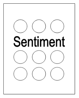
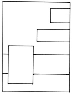
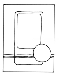
Over at Seven Hills Crafts, they have provided a sketch as inspiration for their September Challenge:
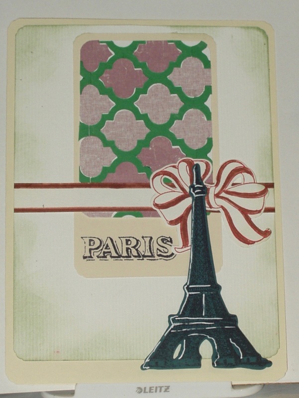
In addition to using this sketch, the rules of this monthly challenge include using products sold by Seven Hills. I chose to use an Altenew Stamp Set: "Ramadan Greetings" and to make a card for my stash so that, when the next Ramadan rolls around, I will have a card to send to our Suadi friends.
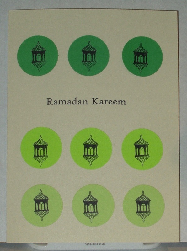
Products used in the making of this card were:
- Stamps: Altenew "Ramadan Greetings"
- Inks: Archival "Jet Balck"
- Papers: The Paper Studion Value Pack "ivory"; scraps of three different green papers
- Tools: EK Success 1 3/4" circle punch
- Adhesives: Ranger Collage Glue
 RSS Feed