The Frilly & Funkie Challenge Bog challenge for July 27, 2016 is entitled “By The Sea”. Be it at the shore where we find sparkling sands, delicate shells and refreshing breezes, cruising on the sea , or exploring under the sea, they was a vintage or shabby chic project that features a nautical or beach theme and color palette.
I seem to be participating in a LOT of sea-themed challenges this month. There was the July 13, Simon Says Stamp Wednesday Challenge to “Create a Scene”, the Simon Says Stamp Monday Challenge for July 18 to be “Nautical/ By The Sea”, and my July entry in the Tim Holtz 12 Tags of 2016…
While we live lakeside, it doesn’t quite cut it when it comes to the sea! I think it’s in my blood… As a child, we visited the Grandparents in New Jersey every summer and one of the highlights was going “to the shore” at Manasquan for the beach (and the seafood) or Asbury Park (for the amusement park) or Ocean Side (where my Aunt and Uncle and cousins had a summer cottage). I carried that love of the sea to when we lived in Florida (we used to camp on the beach near Jacksonville, did the Sanibel Shuffle on Sanibel Island looking for shells, drove the causeway to Key West, and took invertebrate biology field trips to Cedar Key and Seahorse Key), California (the beaches south of Los Angeles, north of San Diego and along San Francisco’s ocean shore are highlights, if somewhat colder than I like) and even Texas (Galveston Bay and South Padre Island, the latter in mid-winter…). Oh, and then there was that lovely picnic on the Sussex shore in England (in the rain, with cucumber and fish paste sandwiches with Tony and Rosemary), and walks on the strand at St. Ives in Cornwall or at Amalfi in Italy...I’m an ocean-side kind of gal, I guess.
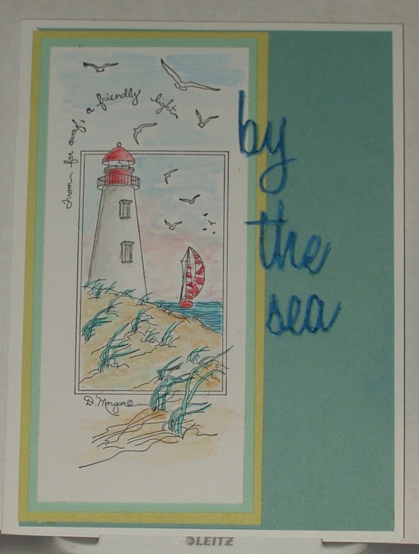
But oddly enough, I don’t remember ever spending any time at lighthouses until we were in England (Cornwall to be specific, and then only at a distance) but that experience alone set me on a collecting spree of lighthouse-themed rubber stamps. I literally have DRAWERS of them! So I opted to go to my lighthouse stamp stash for this challenge and to use a pastel yellowish-tan, sea green and pale sea blue color palette.
I stamped my lighthouse using Archival “Jet Black” ink on Specialty Stamping Paper. I matted the image off-center on sea green, yellowish-tan and pale blue papers. I colored it with Inktense pencils and a detail water brush, blotting between each color layer, and layered the card front onto a prefolded white card. The last touch was die-cut words (left over from when I made that July tag and couldn’t decided if I wanted to go with gold or blue!) in pale blue, overpainted with “Mermaid Lagoon” Distress Marker (so it would coordinate… and show up as well!) and outlined the words with a drop shadow of “Evergreen Bough” Distress Marker:
I seem to be participating in a LOT of sea-themed challenges this month. There was the July 13, Simon Says Stamp Wednesday Challenge to “Create a Scene”, the Simon Says Stamp Monday Challenge for July 18 to be “Nautical/ By The Sea”, and my July entry in the Tim Holtz 12 Tags of 2016…
While we live lakeside, it doesn’t quite cut it when it comes to the sea! I think it’s in my blood… As a child, we visited the Grandparents in New Jersey every summer and one of the highlights was going “to the shore” at Manasquan for the beach (and the seafood) or Asbury Park (for the amusement park) or Ocean Side (where my Aunt and Uncle and cousins had a summer cottage). I carried that love of the sea to when we lived in Florida (we used to camp on the beach near Jacksonville, did the Sanibel Shuffle on Sanibel Island looking for shells, drove the causeway to Key West, and took invertebrate biology field trips to Cedar Key and Seahorse Key), California (the beaches south of Los Angeles, north of San Diego and along San Francisco’s ocean shore are highlights, if somewhat colder than I like) and even Texas (Galveston Bay and South Padre Island, the latter in mid-winter…). Oh, and then there was that lovely picnic on the Sussex shore in England (in the rain, with cucumber and fish paste sandwiches with Tony and Rosemary), and walks on the strand at St. Ives in Cornwall or at Amalfi in Italy...I’m an ocean-side kind of gal, I guess.
But oddly enough, I don’t remember ever spending any time at lighthouses until we were in England (Cornwall to be specific, and then only at a distance) but that experience alone set me on a collecting spree of lighthouse-themed rubber stamps. I literally have DRAWERS of them! So I opted to go to my lighthouse stamp stash for this challenge and to use a pastel yellowish-tan, sea green and pale sea blue color palette.
I stamped my lighthouse using Archival “Jet Black” ink on Specialty Stamping Paper. I matted the image off-center on sea green, yellowish-tan and pale blue papers. I colored it with Inktense pencils and a detail water brush, blotting between each color layer, and layered the card front onto a prefolded white card. The last touch was die-cut words (left over from when I made that July tag and couldn’t decided if I wanted to go with gold or blue!) in pale blue, overpainted with “Mermaid Lagoon” Distress Marker (so it would coordinate… and show up as well!) and outlined the words with a drop shadow of “Evergreen Bough” Distress Marker:
I’m also entering this in the Simon Says Stamp Wednesday Challenge for Jul 27, 2016 - Anything Goes
Products used in making this card were:
Products used in making this card were:
- Stamps: Stamps Happen Inc “A Friendly Light” (80150)
- Inks: Archival “Jet Black”; Intense Pencils “Poppy Red” (0400), “Baked Earth” (1800), “Ink Black” (2200), “”Sea Blue” (1200), “Teal Green” (1300) and “Antique White” (2300); Distress Markers: “Evergreen Bough” and “Mermaid Lagoon”
- Dies: Thinlits “Vacation Words - script” (661288)
- Papers: Creative Memories Power Palette “Cabana Monochromes” and “Cabana Designer Papers”; The Paper Studio Value Pack “white”; Ranger Specialty Stamping Paper; scrap blue card
- Adhesives: Xyron 500 sticker maker; Viva Las Vegas “Miracle Tape”
 RSS Feed