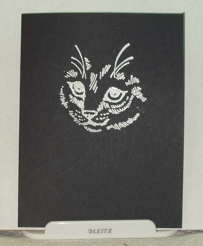
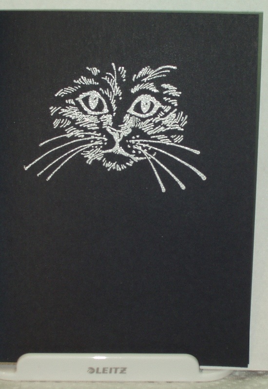
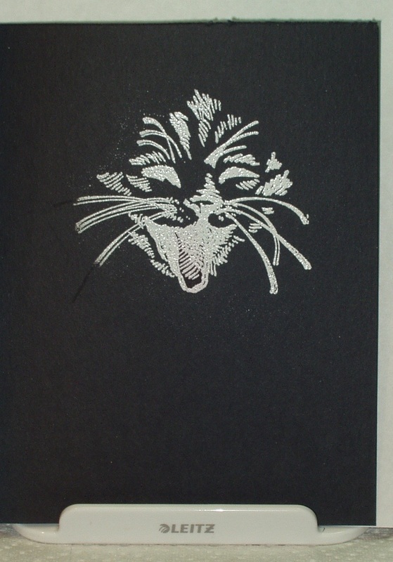
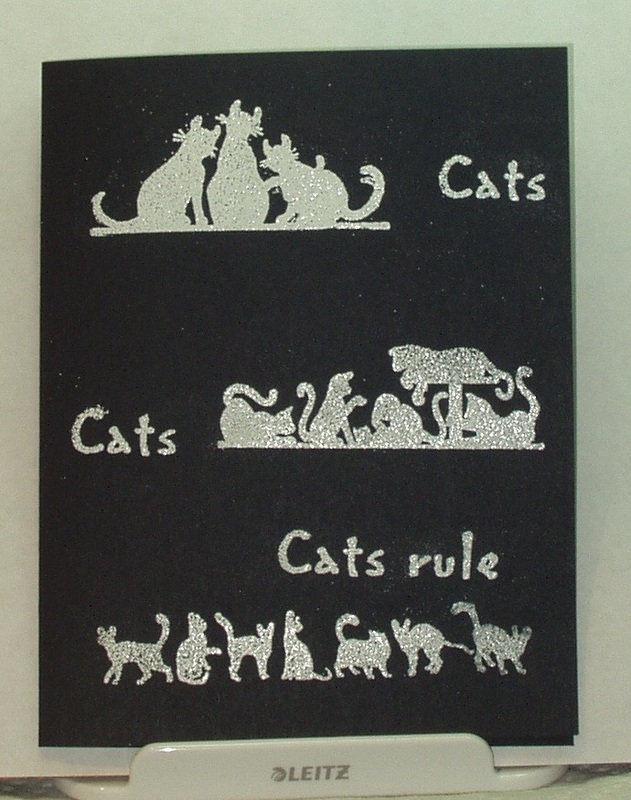
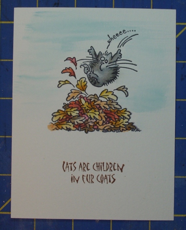
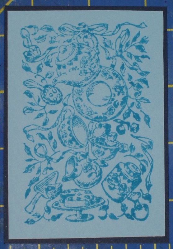
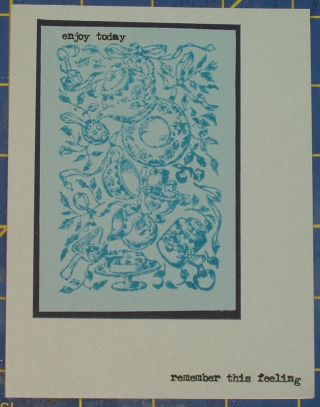
My card in my second post today was not as successful as I would have liked since the sentiment came out a tad crooked in the end. So I thought I'd try one more time for the Simon Says Stamp Wednesday Chalelnge for July 8, 2015, and use a different approach to the clack-and-white theme! This time, I thought I'd make a set of note cards which can be used for any occasion. I had four stamps from Stampendous which were similar in nature but not easily incorporated into a traditional card. So I stamped them in Versamark and embossed with white embossing powder on black card stock: Then I hauled my Big Kick, magnetic base plate and Thinlits "Adventure" script (660224) and cut sentiments from a scrap of glossy white card. I attached these sentiments to the card face using Ranger's Collage Glue Stick: 
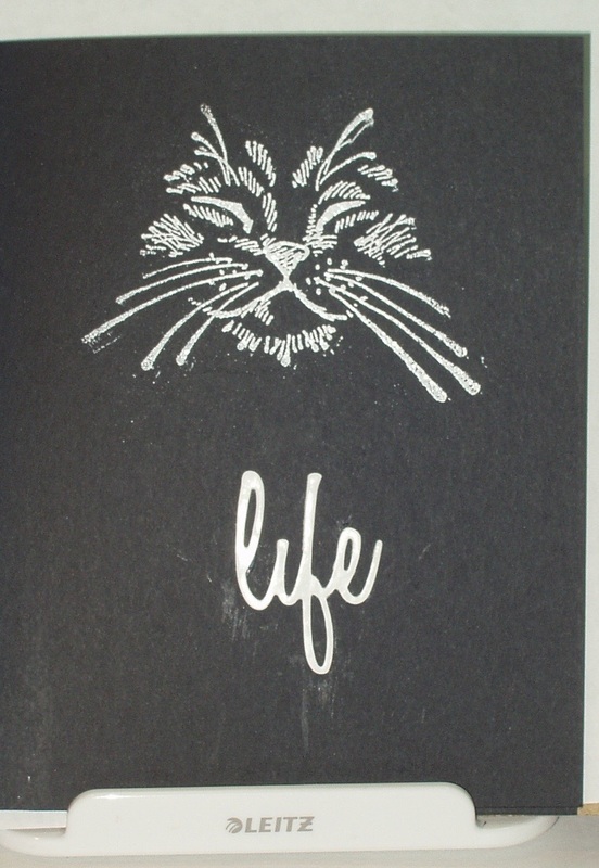
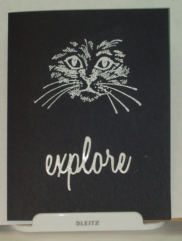
Now all they need is a white insert onto which a note can be written or a sentiment stamped, whatever the occasion!
1 Comment
As I said in my last post, I have a plethora of cat-themed stamps and I couldn't stop at just one furry friend card for the Simon Says Stamp Wednesday Challenge for July 8, 2015. I thought I'd play around with black and white, being reminded of Benjamin Franklin's statement that, "at night, all cats are gray!" and Deng Xiao Ping's equally memorable quote, "It doesn't matter if a cat s black or white, so long as it catches mice!" So my cats are white on a black ground. I used Versamark and white embossing powder and four stamps and stamped on black card to get this simple one-layer card: Products used:
The Simon Says Stamps Wednesday Challenge for July 8, 2015 is to make something with or for one's furry friends, and states " Any furry critters will do !" Well, for me, it has to be cats! We are currently owned by three cats: whoa re the latest in a long line of cats throughout our fifty+ years of marriage! My husband claims that I have the genes to become a cat lady in my dotage, even though he is the one who has picked out the last 8 of our furry friends! For me, cat collecting probably will lean more towards stamps, as I already have at least two Iris Cart drawers double layered with cat-themed stamps! So I have no shortage of furry friend card-making possibilities! I started by making a background using An Inkadinkado stamp of a pawprint (8885-K) and "Old Paper" Distress Ink on an ivory card base. I then blended "Old Paper" onto the edges: Now seeing pawprints like this isn't uncommon in our household but, I'm afraid most fo the prints are obscured by the next step, my theme stamp. I took a piece of Tim Holtz Distress Water Color Paper and stamped with Archival "Jet Black" (the stamp is from Stampendous and called "Fluffles Leap", 8885-K): I watercolored the image with Distress Markers, a detail and wide brush water brush, Then I stamped a sentiment from Rubber Tree Stamps.com ("Cats Are Children", 84-49) in "Vintage Photo" Distress Ink and trimmed the piece to size: Next step was card assembly. I layered the image and sentiment with two colors of yellow scrap card and attached it to the center of the main card (see, can't tell those are pawprints!): Product used:
Simon Says Stamp Monday Challenge, July 6, 2015, says “With the popularity of coffee and tea themed stamps, die cuts, and more it was only a matter of time before we took this on as a challenge! You’re welcome to tea stain your paper, leave a coffee mark on your page, use Tim Holtz new coffee or tea stamps or dies, or be inspired by your own favorite beverage!” Well,, they are right about the recent popularity. I have actually made two coffee/tea themed tags in the last few weeks, the first was for a favorite technique where I recycled an actual coffee-to-go cup while the second was for Tim Holtz’s 12 Tags of 2015 (June) where I used a stamp set from Tailored Expressions. I didn’t want to do the same recycling thing for this challenge (besides, no new take-out cups to cannibalize!) , or use the same stamps, and I don’t own any of Tim Holtz’s coffee or tea themed stamps or dies (I do own the coffee themed apron. but that doesn’t count!), so I searched my stamp stash for yet another coffee or tea-themed stamp. After nearly 30 minutes of searching (yes, I have that many stamps, and no, they aren’t catalogued or stored in any meaningful way), I did find a stamp I have had for a very long time and have never used (these challenges are forcing me to find and use stamps I bought on a whim and put away, never to see the light of day or the surface of an ink pad until now!)! So, trying to evoke memories of our years in London, where making tea was a ceremony that was considered a curative for all things (I actually shocked our English landlord when he found I actually knew how to brew tea the “proper” way), I set about making this card. First, I stamped the background stamp from the Kodomo Inc. set “Tea Medley” (3938-009) on a scrap piece of light blue cardstock using “Mermaid Lagoon” Distress Ink. Then I layered it on a scrap of navy cardstock and trimmed to fit my Memory Box “Russian Sage” pre-folded card: I attached the panel to the pre-folded card off center, leaving room for some rub-ons from the Remnant Rub “Life Quotes” collection: Finally, I stamped the tea cup and tea pot from the Kodomo set onto a scrap of white card stock using Archival “Jet Black”, fussy cut them, colored them in with Distress Markers (“Abandoned Coral” and Cracked Pistachio” ) and my Marvy Uchida “Liquid Gold” pen, and glued them to the card front:
The Frilly and Funkie Challenge for July 1, 2015 was to "make your sentiment the main focus of attention on your vintage or shabby chic entries."
I took this literally, although I still wonder if I can claim this card is either vintage or shabby chic (I tend to lean toward CAS, personally!). Anyway, the sentiment I chose was a Stamp Oasis stamp called "The Stars Exist" (1262-L) so I needed to find something that worked with stars. Wouldn't you know, I have several sentiments dealing with stars but only one star stamp and it didn't work with this sentiment! So I tried using a layering stencil ("Stars", THS008) on dark navy cardstock, using Versamark ink and then heat embossing with Silver (Topp Boss) and White (InkNpressions) embossing powders. I layered the navy card on to Hot Off The Press "Paper Pizazz" specialty Silver Metallic paper and then onto a prefolded ivory card. Next, I stamped the sentiment in Archival "Jet Black" onto ivory cardstock and then layered that on more Silver Metallic paper. I centered the sentiment on the card front and... Oh my, only two more pages of techniques to play with after this challenge. It's going to be so strange to not be looking forward to Saturdays for this challenge series! This series of challenges, based on the contents of Tim Holtz's book, Compendium of Curiosities, VOl. 3, is hosted by Linda Ledbetter from her blog Studio L3, and she is assisted in this challenge by a design team of eight talented artists, two stores and the team of Tim Holtz and Mario Rossi II. Linda and the design team put together their interpretations of the bi-weekly challenges, the stores offer gift certificates for winners in alternating weeks (challenge #32 challenge is sponsored by The Funkie Junkie Boutique) and Tim and Mario have donated a cache of goodies form which another prize is assembled. The rules are simple: • One must work from the book and not reveal Tim's techniques (If you don't have the book, you can get one, autographed, from Tim) • You need to link your creation to Linda's blog • You need to visit the design team's blogs and leave comments on their interpretations. This week’s challenge is to implement the technique described on Page 59 of the book: “Frosted Film”. I had never used the products specified in this technique and, in fact, had to order some of them, but they came in time and I played around with the technique. My first attempt was just satisfactory (Using Tattered Leaves 656927, and Archival Inks “Leaf Green”, “Fern Green”, “Aquamarine” and “Chrome Yellow”). I went with spring colors as I wasn’t in the mood for Autumn yet again and it still doesn’t feel like Summer has arrived! But the leaves were too large for my tag and didn’t lend themselves well to any composition I could come up with so I tried again, using the Mini-Branch & Leaf Set (657208) and the same inks. Better, although shaping these smaller leaves is a lot harder! Since they were spring leaves, it seemed that they needed a branch to be attached to, so I used the same die set, brown cardstock, “Gathered Twigs” Distress Ink and “Gathered Twigs”, “Black Soot” and “Vintage Photo” Distress Markers to create that branch on my tag. Still, it needed more so I searched my stamps and found a bird on a limb of the right scale in the French Connection set (CSS27850). I stamped the image in “Vintage Photo” so that it looked like it was part of the cardstock branch and colored the bird with “Gathered Twigs”, “Black Soot” and “Fired Brick” Distress Markers so it became “the first robin of spring”. Now we needed something in the background so I tried two different techniques: the one Tim used in his April Tags of 2015 (“Iced Spruce” and “Evergreen Bough” Distress Markers using the Distress Spritzer) and, over that, a stencil (“Blossom” THS031) and “Iced Spruce” and “Tattered Rose” Distress Inks. I then blended “Tumbled Glass” and “Antique Linen” Distress inks onto the edges of the tag to soften the stark white of the card stock. Now it looked like there was a flowering tree behind my bird and branch, partially obscured by a morning fog. That set the scene for the branch being part of a flowering tree! So I dug out my Petaloo “Color Me Crazy” paper flower stash and sprayed some of the smaller blossoms with Distress Spray “Festive Berries”, making sure that only a few of the blossoms were saturated with color. After they dried, I auditioned them on the tag so I could place my leaves and sentiment properly. The sentiment, a Hero Arts stamp “Spring” (C3037) stamped in “Fern Green” went in the lower right corner of the tag, the leaves were attached to the branches using Glossy Accents, the sprayed flowers were then scattered through the branches and drifting to the ground (each centered with a dark red 11/0 Czech Glass Seed Bead). I died some crinkle ribbon with “Tumbled Glass” and “Broken China” Distress Ink and, voila! Product used was:
It stands to reason that July's tag would be an Independence Day tag, and, as luck would have it, I received a set of dies from Funkie Junkie Boutique only this past weekend that would be perfect for such a tag, especially since I work in a smaller scale that Tim does on his demonstration and there just wasn't room for a complete set of mini blueprints (even though I do own a set! ). So I plotted out how to make a similar tag without using all the bits and pieces in the example. I think I succeeded... First, I layered some cardstock from Maja Design's "Vintage Summer Basics" 6x6 stack (another arrival this past weekend! on a small tag. It felt a little rustic, a little bit country to me... Then I used the two new die sets (Alterations"s Movers & Shakers "Mini Old Glory" 657477 and Bigz "Old Glory" 657483) to cut four versions of the small flag (only red, blue and gold are shown here as white didn't show up!) and one star border: My next step was to cut and reassemble the flag on a base of typewriter paper, using Ranger Collage Glue Stick: I stamped the USA from Mini BluePrints 2 (CMS 146) on Tim Holtz Distress Water Color Paper and colored it in with Distress Markers (Barn Door", "Faded Jeans" and "Pumice Stone" ) and a Detail water brush. Then I stitched it to the tag and trimmed it to fit. Next up was attaching the star border and the flag, and adding a little "Pumice Stone" shading to the folds in the flag: It felt like something was missing around the flag so I dug out my July 4 stamps and found two fireworks stamps (Victoriina Originals “Small Fireworks”, D1422; and Inkadinkado #95524) which I inked with "Barn Door" and "Faded Jeans" markers and then stamped in the blank spaces: The final touch, the red-white-and-blue crinkle ribbon, was also part of the Funkie Junkie shipment! Fit in perfectly, even if it is sort of a cheat, not dying my own!
Have a glorious (and safe) Fourth of July, ya'll! The Simon Says Stamp Wednesday Challenge for July 1, 2015 is "We're going Dotty!". Anything with spots, dots, and/or something else that ryhmes with spots!
What a coincidence! When I was working on my card for the Monday Challenge, I made another background using the Ken Oliver Color Burst pigments and was trying to come up with something that would work with all the "Violet", "Ultramarine Blue" and "Pthalo Green" that were overwhelming the card front (I had issues with that Violet --- very hard to control the spritz of powder and I got WAY too much on the card.). It wouldn't work with a "normal" image or sentiment and so I painted a color wash of blue, using the Distress Marker "Mermaid Lagoon" and a detail water brush over the top of the card to try to tone the splatter effect down a little. Once dry, the Color Burst powders seem to be pretty resistant to reactivation, although where there was “too much” powder applied, it did reactivate and streak when I brushed my watercolor wash over the top. I then searched my stamps for something that was as random as the background. I stumbled upon a stamp I hadn''t used yet! It was "On the Spot" by Stampin' Up! (circa 2004). So I mounted it (yes, it had sat in the drawer since 2004, never even opened, let alone mounted!) and stamped the background with Versamark and then heat-embossed with Commotion Clear Tops' “Bright Mediterranean Blue” (161327). I stamped a sentiment from another Stampin' Up! set ( "So Very", circa 2007) in Archival "Jet Black" and re-inked the word "So" with a Signo Uniball white pen (the "Jet Black" couldn't compete with the purple blotch! Even the Signo pen couldn't as it did pick up a faint purple tint from the background!). |
AuthorBorn in New Jersey, I grew up in Southeastern Ohio. Attended university at Bowling Green State University (B.Sci in biological science, 1964), University of Southern California (M. Sci in biological science, 1967) and University of Florida (Ph. D in zoology, 1971). Archives
June 2023
Categories
All
PAST PARTICIPATION
CHALLENGE BLOGS
So proud!
for my entry in the Funkie Junkie Boutique Blog Challenge, August 14, 2019 "Let’s Do It Again"
Online Card Classes |